- NSPA >
- Private: Awards >
- 2015 Cartooning Awards
2015 Cartooning Awards
Co-sponsored by Universal Uclick
EDITORIAL CARTOON
1. Sam Willett
The Watchdog, Westfield HS, Chantilly, Va.
2. Angeline Stein
The Stinger, Emmaus HS, Emmaus, Pa.
3. Cynthia Chaelim Lee
Knight Times, Gyeonggi Suwon International School, Suwon Gyeonggi-do, S. Korea
4. Ella Sams
Odyssey, Clarke Central HS, Athens, Ga.
5. Stella Jorgensen
The Scroll, The American School in London, London, England
HM. Rebecca Schena
The Mark, Menlo Atherton HS, Atherton, Calif.
HM. Kat Flocke
U-High Midway, University HS, Chicago, Ill.
HM. Madison Graves
The Express, Blue Valley Northwest HS, Overland Park, Kan.
HM. Alivia Benedict
The Booster Redux, Pittsburg HS, Pittsburg, Kan.
HM. Laura Mulrooney
The Bear Facts, Lake Braddock HS, Burke, Va.
COMIC PANEL/STRIP
1. Kelsey Keranen
West Side Story, Iowa City West HS, Iowa City, Iowa
2. Alex Ralston
Epic, Shawnee Mission West HS, Overland Park, Kan.
3. Zach Tronson
The Echo, St. Louis Park HS, St. Louis Park, Minn.
4. Fangrui Tong
Invictus, Ward Melville HS, East Setauket, N.Y.
5. Jiva Capulong
The HiLite, Carmel HS, Carmel, Ind.
HM. Emmanuel Maresca
Matador, San Gabriel HS, San Gabriel, Calif.
HM. Rachel Pacitti
Eastside, Cherry Hill HS East, Cherry Hill, N.J.
HM. Walter Johnson
The ReMarker, St. Mark’s School of Texas, Dallas, Texas
HM. Brooke Kushwaha
The Review, St. John’s School, Houston, Texas
HM. Miranda Bomer
Panther Prowler, Pflugerville HS, Pflugerville, Texas
JUDGE’S COMMENTS
Editorial Cartoon
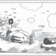
First Place: An excellent depiction of a pressing social issue: the absorption of people in their phones at the expense of personal contact. Cupid’s screen-absorbed expression and supine posture illustrate the depth of his phone-driven infatuation while his traditional duties – and traditional courtship in general – go all but forgotten. The horizontal shading behind the cloud works nicely with the fine lines of the illustration while the white space gives it room to breathe. This op-ed cartoon would be right at home in the pages of a major American newspaper or magazine, and it pairs perfectly with the accompanying editorial column.
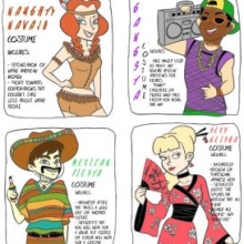
Second Place: A comprehensive illustration of the stereotyping that occurs behind the seemingly innocuous rituals of school spirit costumes and Halloween, this cartoon combines attractive, colorful artwork with thought-provoking content. Contains more text than a typical editorial cartoon, but it works here because the writing is sharp and effective. Money line: “Stereotype that you will wear for one night, but people of color will wear for a lifetime.”
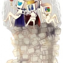
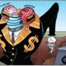
Third Place: This professional-caliber editorial cartoon does an effective job of characterizing Internet powerhouses as smug oligarchs of a non-neutral Net. The sparing use of color creates a visually dynamic scene, and the icons make the cartoon understandable without needing to use written labels. Adheres nicely to the content and space of the accompanying editorial column.
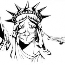
Fourth Place: A simple and effective way to illustrate America’s conflicted stance toward foreign visitors due to Ebola. The bold line work and shadows in the Statue of Liberty’s face give this image a dynamic impact.
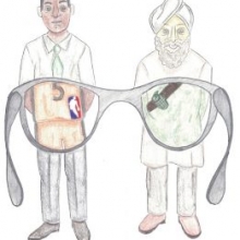
Fifth Place: Presenting this comic from the point of view of the reader helps give this comic a more immediate impact, forcing the reader to consider whether they, too, see others through the lens of stereotypes such as those included in this comic. The details in the illustration are well executed and the shading and coloring are nice and subtle, but I wonder if using black ink, experimenting with computer-generated coloring or using sharper tones of black and gray might make an illustration like this look more professional and less like an art assignment.
Comic Panel/Strip
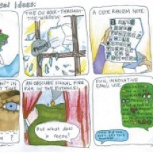
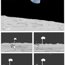
First Place: Brought several chuckles to the judging panel. This comic uses imaginative writing and skillful, detailed artwork to present a timeless aspect of high school life in an offbeat, unexpected manner. The absurd, extreme ways of asking out a date satirize the lengths students go to break the mold in asking each other to prom, and are fun to read in themselves. Who wouldn’t want a lizard bouquet?
Second Place: An attractive, amusing and imaginative large-format comic that would be right at home beside the work of the top print and Web cartoonists. Crisp, clean illustration, a nice, sparing use of color, and overall excellent execution to a fun idea. The title has a nice sound to it as well.
Third Place: Funny cartoon about modern sociological behavior. Nice shading in the comic, and details like the ground being trampled give it a dramatic, kinetic feel. I love that we’re treated to the restaurant manager’s private moment of nervousness before he throws open the doors.
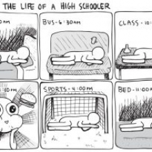
Fourth Place: Professional caliber illustration in this comic. The lack of motion in the other five panels makes the fourth “lunch” panel really stand out. Nice cross-hatching and use of white space, and the balance and composition of each individual panel makes for a harmonious viewing experience.
Fifth Place: More of an editorial cartoon than a comic strip, this comic does an excellent job of presenting the scale of individuals vs. corporate interests when it comes to the future of the Internet. The three-headed monster is a fitting conceit that is executed attractively, with a good use of gradients in the colors. The curtain of 1s and 0s in the background is a nice touch.
Minneapolis, MN 55439
info@studentpress.org
