2010 Design of the Year
co-sponsored by Adobe Systems
Newspaper Page One
First Place
Taylor Brown
Dart, St. Teresa’s Academy, Kansas City, Mo.
Second Place
Taylor Parker, Emma Claucherty
The Viking Longboat, Haslett HS, Haslett, Mich.
Third Place
Courtney Seddon
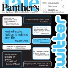
Panther’s Tale, Derby HS, Derby, Kan.
Honorable Mention
Michael Stolle
The Harbinger, Shawnee Mission East HS, Prairie Village, Kan.
Honorable Mention
Sarah Strand
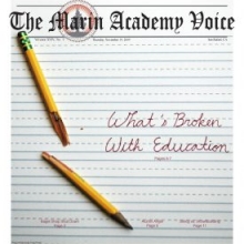
The Voice, Marin Academy, San Rafael, Calif.
Newspaper Page/Spread
First Place
Benjy Mercer-Golden
The Standard, American School in London, London, England
Second Place
Sarah Hudson
The Crimson Courier, Cypress Woods HS, Cypress, Texas
Third Place
Tyler Hein
The Scout, Overland HS, Aurora, Colo.
Honorable Mention
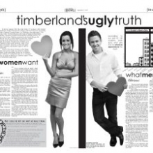
Cara Eckert, Hollan Linn and Caleb Quinn
The Wolf’s Howl, Timberland HS, Wentzville, Mo.
Honorable Mention
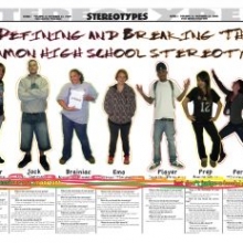
Jane Culkin, Amelia Kucic, Marjie Ruby, Grace Michaels
The Surveyor, George Washington HS, Denver, Colo.
Honorable Mention
Grayson Cameron
Redwood Bark, Redwood HS, Larkspur, Calif.
Yearbook Page/Spread
First Place
Kayla Davidson
Hornet, Bryant HS, Bryant, Ark.
Second Place
Chelsea Weis
Aurora, Wausau West HS, Wausau, Wis.
Third Place
Sravani Mannuru, Sara Walls
Governor, John B. Connally HS, Austin, Texas
Honorable Mention
Anna Glendening, Natalie Mabile, Marissa Gitler, Hannah Kirby
The Clan, McLean HS, McLean, Va.
Honorable Mention
Erin Tachi
Legend, William R. Boone HS, Orlando, Fla.
Honorable Mention
Sarah Brand, Chantelle Cloutier
Minotaur, Bloomingdale Sr. HS, Valrico, Fla.
Magazine Page/Spread
First Place
Alyssa Minnis
The Coup, James W. Martin HS, Arlington, Texas
Second Place
Brian Masters
Mirage, Seminole Ridge HS, Loxahatchee, Fla.
Third Place
April Hernandez
Pegasus, Burges HS, El Paso, Texas
Honorable Mention
Sam Gasmer, Sophia Penske
Tenth Muse, Harvard Westlake MS, Los Angeles, Calif.
Infographic
First Place
Radhika Madhavan
Spark, Lakota East HS, Liberty Township, Ohio
Second Place
Phoebe Unterman
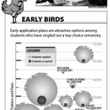
The Harbinger, Shawnee Mission East HS, Prairie Village, Kan.
Third Place
Samantha Rosier
The Prowl, Coral Glades HS, Coral Springs, Fla.
Honorable Mention
Julia Gabbert
North Star, Francis Howell North HS, St. Charles, Mo.
Honorable Mention
Patrick Svitek
The Spartana, Homestead HS, Fort Wayne, Ind.
Honorable Mention
Paris Gravley, Rebecca Wynd
Redwood Bark, Redwood HS, Larkspur, Calif.
Illustration
First Place
Tanner Maxwell
Lion’s Roar, Goddard HS, Goddard, Kan.
Second Place
Andrew Atallah, Josh Zillwood
The Roundup, Brophy College Preparatory School, Phoenix, Ariz.
Third Place
Edward Yeung
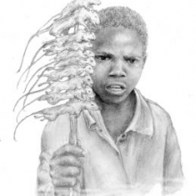
Ilium, Troy HS, Fullerton, Calif.
Honorable Mention
Victoria Cornejo
Chieftain, Montrose HS, Montrose, Colo.
Honorable Mention
Qinyi Fan, Christian Jun
Mount Carmel Sun, Mount Carmel HS, San Diego, Calif.
Honorable Mention
Rosie Steinbach
The Viking Log, Forest Grove HS, Forest Grove, Ore.
Judges’ Comments
Newspaper Page One
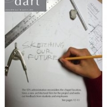
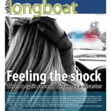
Overall comments: Many of the submitted pages were hampered by trying to do too much on the page. These were excellent examples of picking one great story and running with it. The Twitter page was fabulous. The accident story really grabbed the reader right away, and was very well done. But the winner tied everything together, with a clever photo illustration that incorporated the headline and a good summary of the cover story.
Yearbook Page/Spread
First place:
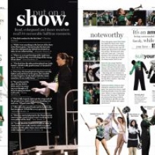
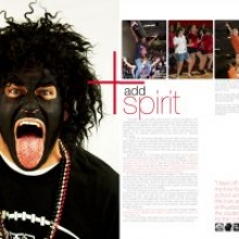
The most creative spread in the competition that is easy to follow, shows energy, imagination and a strong focal point to grab the reader’s attention. Good use of all the basic design elements and an excellent use of the photographs to create a visual stimulating page. Clean typography with the addition of the handwritten sidebar add to the personality and friendliness of the spread. Tilted and sideways headlines/ display and body/text type are normally a design “no, no” because they are difficult to read but they work to add movement to the design of the spread. Good use of eye flow and bleeding on all edges of the page to create a dynamic visual presentation.
Second place:
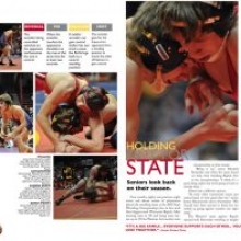
A clean page that has a strong center of visual impact with good use of entry points through spread. Nice to see a lead headline not at the top of the page that does lead you into the beginning of the copy. Good photography is accented with captions that have strong visual lead-ins. Excellent use of the sidebar on the left hand side of the page to add an anchor and vertical movement to the page with the use of the gray back ground, red/yellowish gold Q&A that is anchored with a nicely silhouetted photograph. The simplicity of this spread sets an example for others to follow to make a page easy to follow and visually appealing.
Third place:
A high energy spread that uses roughly 22 images, four segmented sidebars and can still have a strong focal point or center of visual impact that helps lead the eye throughout the spread. Clean typography that has a nicely designed lead headline that shows good use of big/little and dark/light type with negative leading. Excellent use of photography that ranges from silhouetted or cutout images to a strong vertical image that contains text that is easy to read. Excellent use of display type designs on two of the sidebars to pull the reader throughout the spread. A visually appealing spread.
HM: TheClan, McLean HS
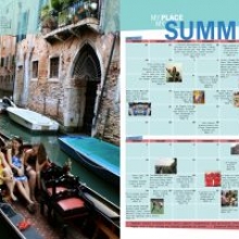
Good use of a dominant photograph that sets the mood/tone of the spread. Nice use of the calendar with text and photo combinations to pull you through the summer months. Nice job of matching the background and secondary color with the lead photography. All be basics of clean, simple and an easy to follow design are on this spread to make it visually appealing.
HM: Minotaur, Bloomingdale Sr. HS
Excellent use of the photo illustration to grab the reader’s attention and anchor the spread. Clean and simple typography is used that is accented by simple use of red spot color to add good eye movement to the page that is anchored with the use of five mugs at the bottom of the page. A clean and simple design that is easily attracts a reader or would pull the eye into the spread.
HM: Legend, William R. Boone HS
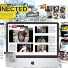
A high energy design that is reader friendly spread through the use of photographs, secondary color, various graphic devices (such as tilts, various sized display type, logos, YouTube images and collage design). This spread breaks all the basic yearbook design rules but is visually stimulating to pull a reader through the page and works with the subject matter of the page.
Magazine Page/Spread
First place:
Visually arresting with excellent typographical and color choices.
Second place:
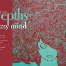
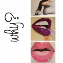
An impressive display of typographical imagery. Very much appreciate the simplistic right-hand page, but it would have been even better played completely straight and without the blue cutout background. Also, a picture is worth a thousand words.
Third place:
Not a new concept but executed at a fairly high level. A nice recap of the decade. Really narrow type should be ragged right to avoid bad H&Js.
Infographic
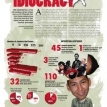
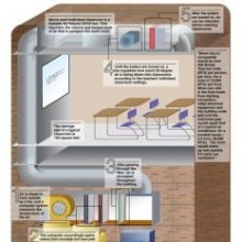
Overall, the infograhpics entries exhibited a high level of visual and journalistic sophistication. Most evident in nearly all the entries was a clear design sensibility. Principles of contrast, hierarchy and navigation were particularly strong across the board.
The top entries stood apart from the others for their effectiveness in illustrating relationships through a graphical construct. This quality was evident whether the relationship being examined was among a sequence of events, a set of numbers or how the parts of a whole interact.
One way to illuminate those relationships is to focus on the graphic narrative. Often the best infographics are those that do more than just present raw information; instead they tell a story visually, with a clear train of thought. It’s important to lead readers through a graphic and help them connect the dots.
I would also encourage students to explore more data visualization. Throughout the category, a number of entries presented information through the use of big numbers. This is a perfectly acceptable format when used judiciously. But the power of infographics often lies in the ability to display quantitative information in a way that makes it salient and arresting.
In general, submissions showed an impressive level of visual literacy and demonstrated a keen interest in making information more accessible to readers. That should be the guiding principle in any infographic, and all entrants should be commended for their understanding of that goal.
Illustration
First place:
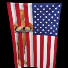
The figure jailed by the American flag is beautifully simple. I did not have the story to know exactly what this is supposed to say. But I can certainly project a number of topics that I think it would illustrate well with regard to the country’s treatment of various groups. It is such a clean piece — I would have no problem running this in my publication.
Second place:
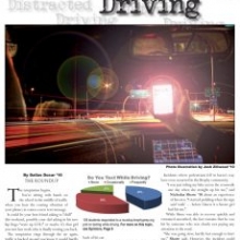
There were two takes on texting and driving and both were good. But the piece in The Roundup wins out because the photo illustration evokes such a strong feeling of being distracted — it includes so many other elements a driver has to deal with while driving. The piece makes it very clear that adding the extra element of texting would raise the danger level.
Third place:
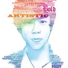
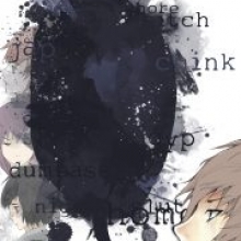
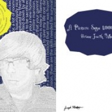
There were also two illustrations that did a good job of incorporating words into the piece. The entry called ‘a picture is worth a thousand words’ is superior because the words were much more legible and they form the basis of the figure in the illustration. It may not be the most original concept to use words to form the shape and texture of a drawing, but this entry does it extremely well. Color usage was very nice, too.


![Layout [8-9] final.indd](https://studentpress.org/nspa/wp-content/uploads/sites/2/2016/05/design10_Michaels_TheSurveyor_GeorgeWashingtonHS-300x204-220x220_c.jpg)
