2011 Design of the Year
co-sponsored by Adobe Systems
New this year: NSPA is honoring up to 10 entries in each category of the Individual Awards. The top five entries in each category have been announced as finalists, and will be announced as first through fifth place winners later at the fall JEA/NSPA convention in Minneapolis. Up to five honorable mentions have additionally been awarded in each category. The honorable mentions are not ranked.
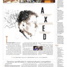
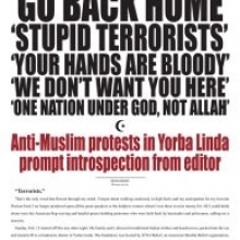
Newspaper Page One
First Place
Ian Robertson
The Standard, American School in London, London, England
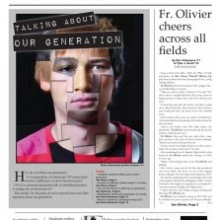
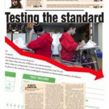
Judge’s comments: The winning entry was a sharp, finished product. Attention to detail is critical is cover designs – and this entry had it. Good use of typography throughout, as well as a beautiful photo, treated well. This is a sophisticated news page. One thing that so many papers need to do is focus on improving their photography. It’s not hard to get excellent quality photo equipment these days – now it’s all about getting the best concepts and executing them well. And don’t forget about effective uses of white space!
Second Place
Hwa Eun Kim
Wildcat, Brea Olinda HS, Brea, Calif.
Third Place
Jake Crump
The Marshfield Times, Marshfield HS, Coos Bay, Ore.
Fourth Place
Leah Cramer
Blue & Gold, Findlay HS, Findlay, Ohio
Fifth Place
Dean Itani
The ReMarker, St. Mark’s School of Texas, Dallas, Texas
Honorable Mention
Rohan Andresen
The Roundup, Brophy College Preparatory School, Phoenix, Ariz.
Honorable Mention
Christin Tang
The Central Times, Naperville Central HS, Naperville, Ill.
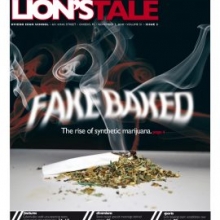
Honorable Mention
Daniel Liss, Daniele Marx, Eitan Sayag
Lion’s Tale, Charles E. Smith Jewish Day School, Rockville, Md.
Honorable Mention
Taylor Delaney, Elena Potek
The Echo, St. Louis Park HS, St. Louis Park, Minn.
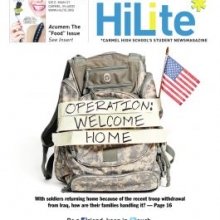
Newsmagazine Cover
First Place
Arjuna Capulong
The HiLite, Carmel HS, Carmel, Ind.
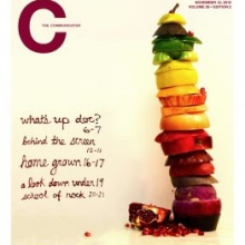
Judge’s comments: There were some great entries in this category. A lot of good concepts, played very well. But this cover stood out from the crowd. It didn’t try to do too much with the idea – they stayed with a simple concept, and executed it very well. Again, the white space and framing of this page makes it stand out. There was a lot of good photography in this category – a must for a successful news magazine cover.
Second Place
Alec Russell
The View, Park Hill South HS, Riverside, Mo.
Third Place
Elizabeth Lin, Jojo Silverman
West Side Story, Iowa City West HS, Iowa City, Iowa
Fourth Place
Liz McCubbrey, Katie O’Brien
Communicator, Community HS, Ann Arbor, Mich.
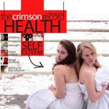
Fifth Place
Virginia Johnson
Crimson Record, duPont Manual HS, Louisville, Ky.
Honorable Mention
Cody Elmore
The Prospective, Bryant HS, Bryant, Ark.
Honorable Mention
Zoe Faselt, Julia Murphy
The Surveyor, George Washington HS, Denver, Colo.
Honorable Mention
Carson Bailey
The Lion’s Tale, Oviedo HS, Oviedo, Fla.
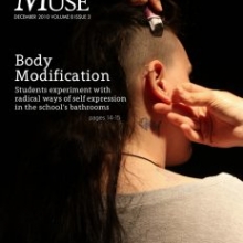
Honorable Mention
Bailey Edelstein, Paige Drummond
The Muse, Dreyfoos School of the Arts, West Palm Beach, Fla.
Honorable Mention
Andrea Shiakolas
The Fourcast, Hockaday School, Dallas, Texas
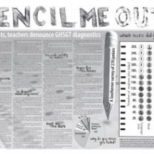
Newspaper Page/Spread
First Place
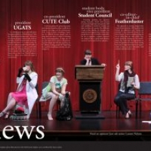
Jenny Messer
Featherduster, Westlake HS, Austin, Texas
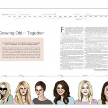
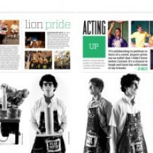
Judge’s comments: Very professional and mature design. Lovely touch, the hat on the sophisticated type styling of the headline. Strong photograph. Well written story with an interesting blurb. Nice color use in the type.
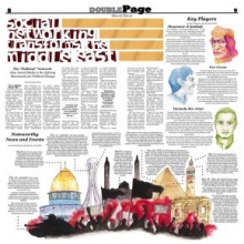
Second Place
Lillie Hodges, Sean Burke, Julia Kent
The Fourth Estate, Laguna Blanca School, Santa Barbara, Calif.
Judge’s comments: A very mature package presented with a unique and interesting illustrative style. Key Players is a good concept. Nice headline style.
Third Place
Jasmine Saein Park, Lucia Minah Yang
Tiger Times, Seoul International School, Seoul, S. Korea
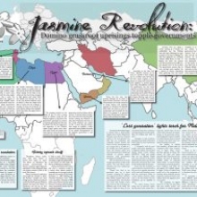
Judge’s comments: An ambitious effort, using the map to make a big infographic is commendable.
Fourth Place
Allison Wang
Rubicon, St. Paul Academy and Summit School, St. Paul, Minn.
Judge’s comments: Smart trend piece as 3D fills the theaters over the summer and becomes the new standard in home TV systems. Smart package, well organized and cleanly designed.
Fifth Place
Caroline Sydney
The Fourcast, Hockaday School, Dallas, Texas
Judge’s comments: Smart and elegant spread with simply one of the best illustrations I have seen from the age group. Fun idea, exceptionally well executed, every bit.
Honorable Mention
Cody Elmore
The Prospective, Bryant HS, Bryant, Ark.
Honorable Mention
Paula Friedrich
The Tower, Grosse Pointe South HS, Grosse Pointe Farms, Mich.
Honorable Mention
Zach Elmore, Christy Kim
Talon, Rockwood Summit HS, Fenton, Mo.
Honorable Mention
Kara Campbell, Max Thoman
Image, Lafayette HS, Wildwood, Mo.
Honorable Mention
Shannon Auvil
Panther Pride, Midlothian HS, Midlothian, Texas
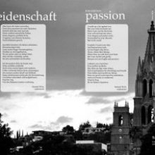
Yearbook Page/Spread
First Place
Madeline Franz, Elise Kelly, Olivia Pocost
Iliad, Whitfield School, St. Louis, Mo.
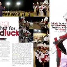
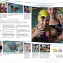
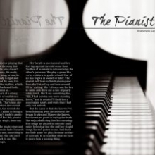
Judge’s comments: Excellent use of strong dominant element that combines the lead-in, headline and main photograph. Excellent use of white space that accents the sidebars and controls the eye movement.
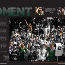
Second Place
Hayden Wolf
Marksmen, St. Mark’s School of Texas, Dallas, Texas
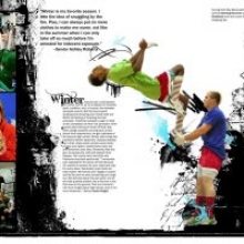
Judge’s comments: Powerful use of clean but striking typography that works with the contrasting of black and white and color images. Easy flowing spread that works from the bottom up.
Third Place
Kyle Cartier, Emma Severson
Tesoro, Rio Americano HS, Sacramento, Calif.
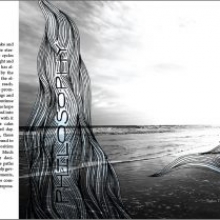
Judge’s comments: Creative use of using black and white combined with color in the main image to catch your attention. Masking of the words in the main headline gives the page a strong visual appeal.
Fourth Place
Kelsi Gunderson, Malia Elliott, Katie Freeman
Legacy, Green Valley HS, Henderson, Nev.
Judge’s comments: Clever use of art and photograph elements together to create a strong center of visual impact that is offset with the strong use of white space and page movement. A fresh spread with clean typography.
Fifth Place
Roya Rakhshan
Leaves, Sherwood HS, Sandy Spring, Md.
Judge’s comments: Lots of visual businesses adds to the organizational flow of the spread. Creating an illustration in the background provides an added dimension. Alternative coverage areas adds to the flow of the spread with contrasting movement and shapes.
Honorable Mention
Dulce Arellano
Pleiades, Fullerton Union HS, Fullerton, Calif.
Honorable Mention
Kristin Enyart
Indian, Shawnee Mission North HS, Overland Park, Kan.
Honorable Mention
Josh Nagy
Esprit de Corps, Eisenhower HS, Shelby Township, Mich.
Honorable Mention
Jenna Cossette
Spartan, Orono HS, Long Lake, Minn.
Honorable Mention
Sarah Kee, Katie Wood, Jackie Choucair
Cornerstones, Hockaday School, Dallas, Texas
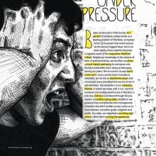
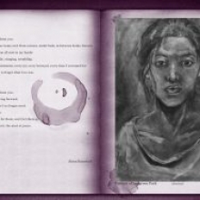
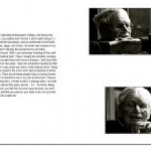
Magazine Page/Spread
First Place
Paris Gravley
Pulp, Redwood HS, Larkspur, Calif.
Second Place
Lauren Pruitt
Iliad, Clarke Central HS, Athens, Ga.
Third Place
Danny Rosenberg, Talia Rodwin
Silver Quill, Montgomery Blair HS, Silver Spring, Md.
Fourth Place
Staff
Catharsis, Coral Gables Sr. HS, Coral Gables, Fla.
Fifth Place
Ashley Deatherage
Vibrato, Hockaday School, Dallas, Texas
Honorable Mention
Carson Bailey
Arts Unleashed, Oviedo HS, Oviedo, Fla.
Honorable Mention
Taylor Tokarz
The Muse, Northview HS, Johns Creek, Ga.
Honorable Mention
Lisa Shofstall
Indian Lore, Shawnee Mission North HS, Overland Park, Kan.
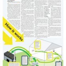
Infographic
First Place
Carson Bailey
The Lion’s Tale, Oviedo HS, Oviedo, Fla.
Second Place
Toni Aguiar
The Harbinger, Shawnee Mission East HS, Prairie Village, Kan.
Third Place
Brandon Morrison
The Mission, Shawnee Mission North HS, Overland Park, Kan.
Fourth Place
Mary McDermott
Play, Maize HS, Maize, Kan.
Fifth Place
Nick Cruz
The Source, Stoney Creek HS, Rochester Hills, Mich.
Honorable Mention
Cody Elmore
The Prospective, Bryant HS, Bryant, Ark.
Honorable Mention
Grayson Fuller, Shaun Kleber
The Southerner, Henry W. Grady HS, Atlanta, Ga.
Honorable Mention
Evan Hughes
The Talon Times, Lakes Community HS, Lake Villa, Ill.
Honorable Mention
Tucker Love
Indian, Shawnee Mission North HS, Overland Park, Kan.
Honorable Mention
Brian Margosian
Andover Shield, Andover HS, Bloomfield Hills, Mich.
Illustration
First Place
Rebecca Xu
The HiLite, Carmel HS, Carmel, Ind.
Second Place
Jamie Kaplan, Chris Bull
El Paisano, Westlake HS, Austin, Texas
Third Place
Oscar Carl
The Muse, Dreyfoos School of the Arts, West Palm Beach, Fla.
Fourth Place
Kelsey Bell
North Star, Francis Howell North HS, St. Charles, Mo.
Fifth Place
Grayson Cameron, Paris Gravley, Ben Damon
Redwood Bark, Redwood HS, Larkspur, Calif.
Honorable Mention
Kael Barton
Pulp, Redwood HS, Larkspur, Calif.
Honorable Mention
Gilberto Ruiz-Ortega
Wingspan, James C. Enochs HS, Modesto, Calif.
Honorable Mention
Andrew Goble
The Harbinger, Shawnee Mission East HS, Prairie Village, Kan.
Honorable Mention
Sarah Elder
Hi-Herald, Bismarck HS, Bismarck, N.D.
Honorable Mention
Michelle Ling
Featherduster, Westlake HS, Austin, Texas
Judges’ summary comments
Yearbook Page/Spread
- Double check that all photographs have a complete caption (Identification or story caption) with photo credit.
- Be sure all pages are edited and proofed for all elements on the spread (verbal visual connection especially)
- Work to design with less tilting and slanting of images.
- All headlines need a deck or secondary head.
- Stronger and more consistent use of alternative copy (sidebars, graphs, interviews) to tell the complete story.
- More surprises in the design with controlled creativity.
- Restraint on the use of color on a spread outside of photographs.
- Design that controls the eye movement on a spread.
- Greater use of contrast in photograph sizes and typographic family ( light vs dark or small vs large typefaces).
- Consistency in the tone or voice of the book.
Magazine Page/Spread
The winner in this category stood out for a combination of compelling imagery and text, and a presentation that was bold and refined. The other winners and honorable mentions shared some but not all of those qualities.
Infographic
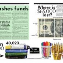
Entries across the board showed a definite sophistication in presenting information in a graphically engaging way. There was a clear sense of the purpose of an infographic: to elevate information in a way that can speak more clearly and more directly through visuals.
The top entries stood apart for their clean style. They demonstrated a level of editing that was consistent with telling a clear story. They also showed great design sensibility—in color, in contrast and in hierarchy.
The editing and design were essential in elevating the top graphics. The important points were highlighted in a way that gave them greater impact; the use of color and hierarchy allowed readers to follow through the narrative more easily.
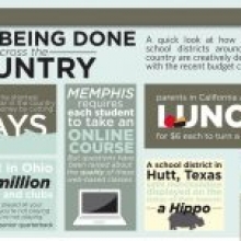
These principles were most evident in the top three entries (“Help for Japan,”, “What’s Being Done Across the Country” and “App Central”). The ease of these graphics is indisputable. There is a consistent color palette, an effective use of visual enticements and a strong hierarchy.
Students should be commended for their inventive use of mixed media. There was an effective mix of various charting and graphic forms, including images, big numbers, charts and illustrations.
I would encourage students to explore more types of data visualizations. Readers are becoming more visually sophisticated, and the top entries demonstrated an acknowledgement of that fact. There’s a hunger for information in new forms, and students should push boundaries in regards to how they present that information.
Illustration
Impressive top three, which presented unique style but shared one attribute: Execution at a very high level. Overall, the top ten offered highly creative visual solutions that were engaging and just flat-out fun. The readers of these stories benefitted from your talents.
