- NSPA >
- Private: Awards >
- 2015 Design of the Year
2015 Design of the Year
NEWSPAPER PAGE ONE
1. Alexis Espinosa
The Fourcast, Hockaday School, Dallas, Texas
2. Philip Smart, Cameron Clark, Zuyva Sevilla
The ReMarker, St. Mark’s School of Texas, Dallas, Texas
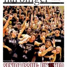
3. Alex Toma, Peyton Butt
Harbinger, Hereford HS, Parkton, Md.
4. Tanner Nypen
The Roundup, Brophy College Preparatory School, Phoenix, Ariz.
5. Mickey Shin
Altitude, Hanford HS, Richland, Wash.
HM. Beryl Kessio
The Crimson Crier, Sparkman HS, Harvest, Ala.
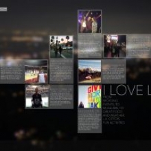
HM. Sadie Hersh, Juliette Deutsch
Highlights, Beverly Hills HS, Beverly Hills, Calif.
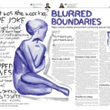
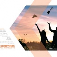
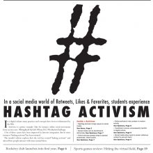
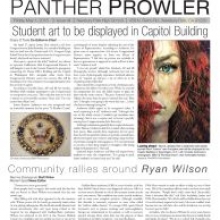
HM. Mariam Syed
The Panther Prowler, Newbury Park HS, Newbury Park, Calif.
HM. Boraan Abdulkarim
Rubicon, St. Paul Academy and Summit School, St. Paul, Minn.
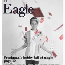
HM. Devynn Sampson
The Eagle, GlenOak HS, Canton, Ohio
NEWSMAGAZINE COVER
1. Chaye Gutierrez, Sabrina Pacha
The Lake, Standley Lake HS, Westminster, Colo.
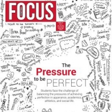
2. Morgan Brader, Emily Herd
Central Focus, Francis Howell Central HS, St. Charles, Mo.
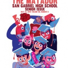
3. Emmanuel Maresca
Matador, San Gabriel HS, San Gabriel, Calif.
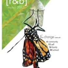
4. Ellie Rodriguez
The Red & Black, Hillsborough HS, Tampa, Fla.
5. Jake Balmer, Trevor Currie
The Kirkwood Call, Kirkwood HS, Kirkwood, Mo.
HM. Brian Zhuang
The Gazette, Granite Bay HS, Granite Bay, Calif.
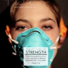
HM. Rowan Bennetti
The Muse, Dreyfoos School of the Arts, West Palm Beach, Fla.
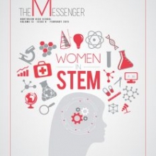
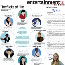
HM. Jessica Ma
The Messenger, Northview HS, Johns Creek, Ga.
HM. Abby St. Claire
Drops of Ink, Libertyville HS, Libertyville, Ill.
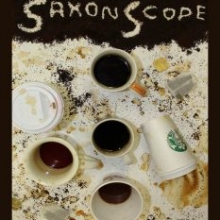
HM. Laura Coffey, Kate Bryan
The Saxon Scope, Langley HS, McLean, Va.
NEWSPAPER PAGE/SPREAD
1. Matthew Conley
The ReMarker, St. Mark’s School of Texas, Dallas, Texas
2. Jessica Ma, Connie Xu
The Messenger, Northview HS, Johns Creek, Ga.
3. Olivia Koontz
The Lake, Standley Lake HS, Westminster, Colo.
4. Sonali Durham
The Little Hawk, Iowa City HS, Iowa City, Iowa
5. Mariya Amato
The Liberty Tribune, Liberty HS, Henderson, Nev.
HM. Astyr Ko
The Wildcat, Brea Olinda HS, Brea, Calif.
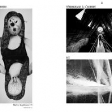
HM. Mary Arienza, Young Cho, Marlyn Devora
Tornado Times, Hoover HS, Glendale, Calif.
HM. Aaron Shi
The HiLite, Carmel HS, Carmel, Ind.
HM. Maddy Bremner
The Echo, St. Louis Park HS, St. Louis Park, Minn.
HM. Zoe Lawson
North Star, Francis Howell North HS, St. Charles, Mo.
YEARBOOK PAGE/SPREAD
1. Amanda Spaccarelli, Anthony Muscarella
Invictus, Ward Melville HS, East Setauket, N.Y.
2. Laurel Noack, Elizabeth Walber
Aurora, Wausau West HS, Wausau, Wis.
3. Habiba Feroze
The Clan, McLean HS, McLean, Va.
4. Andrew Ravan
Vox Populi, Harvard-Westlake School, North Hollywood, Calif.
5. Staff
Archives, Edmond Santa Fe HS, Edmond, Okla.
HM. Tanner Walsh
Shield, Thomas Downey HS, Modesto, Calif.
HM. Bailey Washer
Flashback, Rock Bridge Sr. HS, Columbia, Mo.
HM. Melissa Wyas
Odyssey, Francis Howell Central HS, St. Charles, Mo.
HM. Lauren Camenzind
Excalibur, Francis Howell North HS, St. Charles, Mo.
HM. Carrington Kyle, Elton McIntosh
Marksmen, St. Mark’s School of Texas, Dallas, Texas
MAGAZINE PAGE/SPREAD
1. Katrina Wijaya, Katie Webb
The Mark, Menlo Atherton HS, Atherton, Calif.
2. Marriya Schwarz
Opus, Oakton HS, Vienna, Va.
3. Tasha Wentling
Red Feather, Maize HS, Maize, Kan.
4. Hannah Thomson
The Coup, James W. Martin HS, Arlington, Texas
5. Louise Platter, Ella Sams, Ethan Crane
Iliad, Clarke Central HS, Athens, Ga.
HM. Braden VanMeter
One Blue Wall, duPont Manual HS, Louisville, Ky.
HM. Elizabeth Bukingolts, Madeeha Rizvi, Claudia Rosario
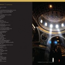
Art and Literature, St. Paul Academy and Summit School, St. Paul, Minn.
HM. Abigail Scheper
Roars and Whispers, Providence Sr. HS, Charlotte, N.C.
HM. Addie Walker
Vibrato, Hockaday School, Dallas, Texas
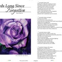
HM. Katie Martin
The Lantern, Albemarle HS, Charlottesville, Va.
INFOGRAPHIC
1. Emma Francois, Sasha Trubetskoy
Hawk Talk, James Madison HS, Vienna, Va.
2. Lacy Hamilton
The Raider Wire, North Forsyth HS, Cumming, Ga.
3. Alex Charnes, Alexis Huynh, ZZ Lundberg
Featherduster, Westlake HS, Austin, Texas
4. Nicole Heetland
The Lake, Standley Lake HS, Westminster, Colo.
5. Michele Moloney, Fangrui Tong
Invictus, Ward Melville HS, East Setauket, N.Y.
HM. Chloe Freitas
Farrier, Mirman School, Los Angeles, Calif.
HM. Maggie Cody
The Central Times, Naperville Central HS, Naperville, Ill.
HM. Scott Liu, Alex Yu
The HiLite, Carmel HS, Carmel, Ind.
HM. Paden Chesney
The Northwest Passage, Shawnee Mission Northwest HS, Shawnee, Kan.
HM. Anisha Patel
Pilot’s Log, Hasbrouck Heights HS, Hasbrouck Heights, N.J.
ILLUSTRATION
1. Vivian Lin
The Chronicle, Harvard-Westlake School, North Hollywood, Calif.
2. Christine Shi
Spark, Lakota East HS, Liberty Township, Ohio
3. Karina Chan
Verde, Palo Alto HS, Palo Alto, Calif.
4. Mitch Feyerherm
The Northwest Passage, Shawnee Mission Northwest HS, Shawnee, Kan.
5. Maddy Bremner
The Echo, St. Louis Park HS, St. Louis Park, Minn.
HM. Kayleigh Fine
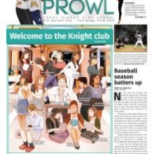
The Prowl, Coral Glades HS, Coral Springs, Fla.
HM. Shelby Shoup, Vijata Patel
The Red & Black, Hillsborough HS, Tampa, Fla.
HM. Hannah Martin
Nexus, Henry W. Grady HS, Atlanta, Ga.
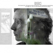
HM. Kelsey O’Connell
Crusader, Marian HS, Omaha, Neb.
HM. Cynthia Chaelim Lee
Knight Times, Gyeonggi Suwon International School, Suwon Gyeonggi-do, S. Korea
JUDGE’S COMMENTS
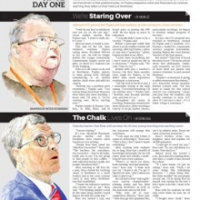
Newspaper Page One: We were searching for a mixture of visuals and context – a page that was as much about the story as it was the visual elements. We were impressed with the clean typography and attention to grids. The entries did a nice job of taking risks and tackling big stories in different ways.
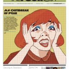
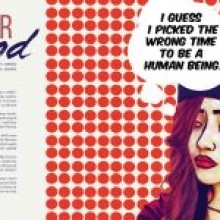
First Place: Everything about this page was spot on. They went bold with a well-executed and eye-catching illustration without ignoring other news in the school. Their use of clean and simple typography and an effective grid helps to elevate the stories, the content and the visuals. It feels like a cohesive page that calls for your attention. Love it!
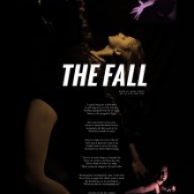
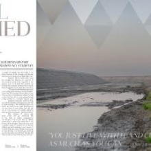
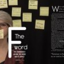
Second Place: The use of white space to emphasize a text-based centerpiece helps draw attention to a very serious topic that is hard to illustrate. The use of restraint allows the idea and the story to come to the forefront. The other page elements stay out of the way without disappearing completely. The simple color pallete and simple typography create a cohesive page.
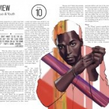
Third Place: Amazing illustration with strong editorial conviction. It’s a huge visual full of context that is really well-played. You could look at this for a long time – and you’re rewarded by the great attention to detail in the illustration. The type matches the style of the illustration and is placed effectively.
Fourth Place: This is a bold front page that pays attention to detail. The grid is strong. The typography is clean. The related content adds a lot of depth to the package and is a huge reader service. They did just enough with the illustration to keep it interesting without going overboard.
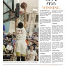
Fifth Place: Great use of whitespace and typography. This page is content driven and all the design decisions are rooted in the story. The decision to pull out part of the lead really draws you in and makes you want to read the story. Very nice!
HM (The Panther Prowler): Simple bold idea – tackling a big topic with a poster page that inspires conversation.
HM (Rubicon): Great visual that draws you into the story. Great play between the visual and the text block. Excellent execution and follow-through with an idea.
HM (Highlights): Excellent use of grid, and restraint in typography, smart story form. Going big with the visual paid off!
HM (The Eagle): Love the visual –it’s more than a standard portrait and says something about the subject. Smart use of spot color. Fun page!
HM (The Crimson Crier): Very bold, idea-driven design that draws the reader in and elevates the story.
Newsmagazine Cover:
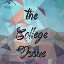
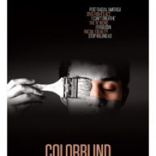
The designs that stood out the most were the ones that had a bold visual, clean typography, and told a clear story. The winning entry from Standley Lake tackled a nationwide issue in a local way, and did it very provocatively. That is a cover that is going to get someone’s attention. Some of the designs stood out simply because the thought behind the main visual was so incredibly smart and well executed, like the Kirkwood Call piece on race. Finally, a few of the entries stood out because the style of illustration was beyond what anyone would expect from a high school publication. The Matador entry is a perfect example of that. Sometimes, when you have a great lead visual, you need to keep everything around it simple and let it speak for itself.
Newspaper Page/Spread:
The top two winners were entries that could have been in higher level – college or even some professional – publications. All of these winners integrated visual elements like photos, illustrations and infographics in an elegant manner while still making it easy for the audience to read and follow the type.
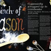
First Place: Great use of color. It creates a small element of surprise while still looking like everything is a package. The extra use of space highlights all of the elements on the page appropriately which works perfectly for a cover to a larger section. It’s bold and eye catching. The photography and typography are executed extremely well.
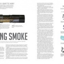
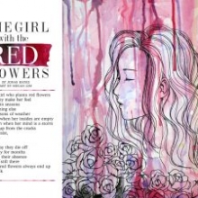
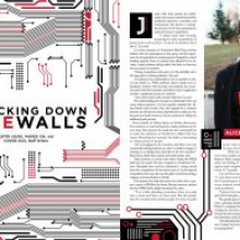
Second Place: Great attention to detail carried throughout the entire package. It’s organized well and it’s clean and eye-catching. The line illustrations and drop caps unite the package, help to beak up the text and add some whimsey without getting in the way.
Third Place: Great attention to details within the illustration, but some of the typography and spacing feels like it could’ve used some more attention.
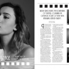
Fourth Place: The ample white space lets the content breathe which draws the reader in. Spacing between elements is smart and deliberate. Great use of photography. However, some of the letters in the accent font are decorative to the point where they’re difficult to read, namely the drop cap T.
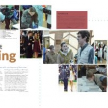
Fifth Place: The first page illustration draws you in. Thought I would have liked to see the headline typography repeated on the second page of the spread. The cutout is fun alongside a selection of participant photos. Loved the experimentation with different techniques, but would caution against using too many in one page.
Yearbook Page/Spread: Our yearbook page/spread winners excel at the fundamentals. Some winners employ dramatic, dominant visuals. Others take distinctive approaches to present their story forms. Yet all allow apply elegant simplicity, and their vibrant content comes shining through.
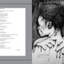
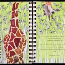
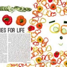
Magazine Page/Spread: I’m impressed by the amount of maturity, emotion and fun I found in this year’s entries. Overall, I looked for the spread that best told a complete story. So many of the entries were beautiful, but I valued the entries that didn’t prioritize art over information. I love The Mark’s colorful use of veggies, which draws the reader into the spread while the content is true to the spread’s overall selling point: vegetables! Another favorite was the Opus’ “Heaven.” I love the hand-drawn detail, the clever use of a vertical headline, and the whimsical giraffe that pops in and out of the spread. However, the colored text box and center alignment made the spread’s content a bit difficult to read.
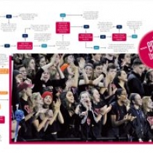
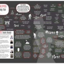
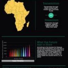
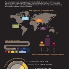
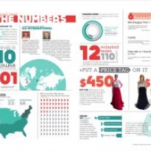
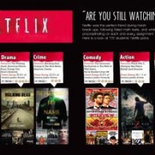
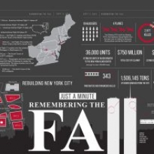
Infographic: Overall, I was really impressed with this category. Infographics are tough and there wasn’t a single bad entry for this category. These students really know how to dissect a story and make it visually presentable for the reader. That will serve them well if they continue as designers.
Illustration: More impressive than any individual entry is the variety of this category as a whole. It’s promising to see such talented young people pursuing the range of styles and media presented in these submissions. Also to be appreciated is the depth of thought many entries conveyed, allowing for discoveries beyond the surface level of a skillfully rendered illustration.
Minneapolis, MN 55439
info@studentpress.org

