- NSPA >
- Private: Awards >
- 2016 Yearbook Pacemaker Winners
2016 Yearbook Pacemaker Winners
Junior High/Middle School
 |
 |
 |
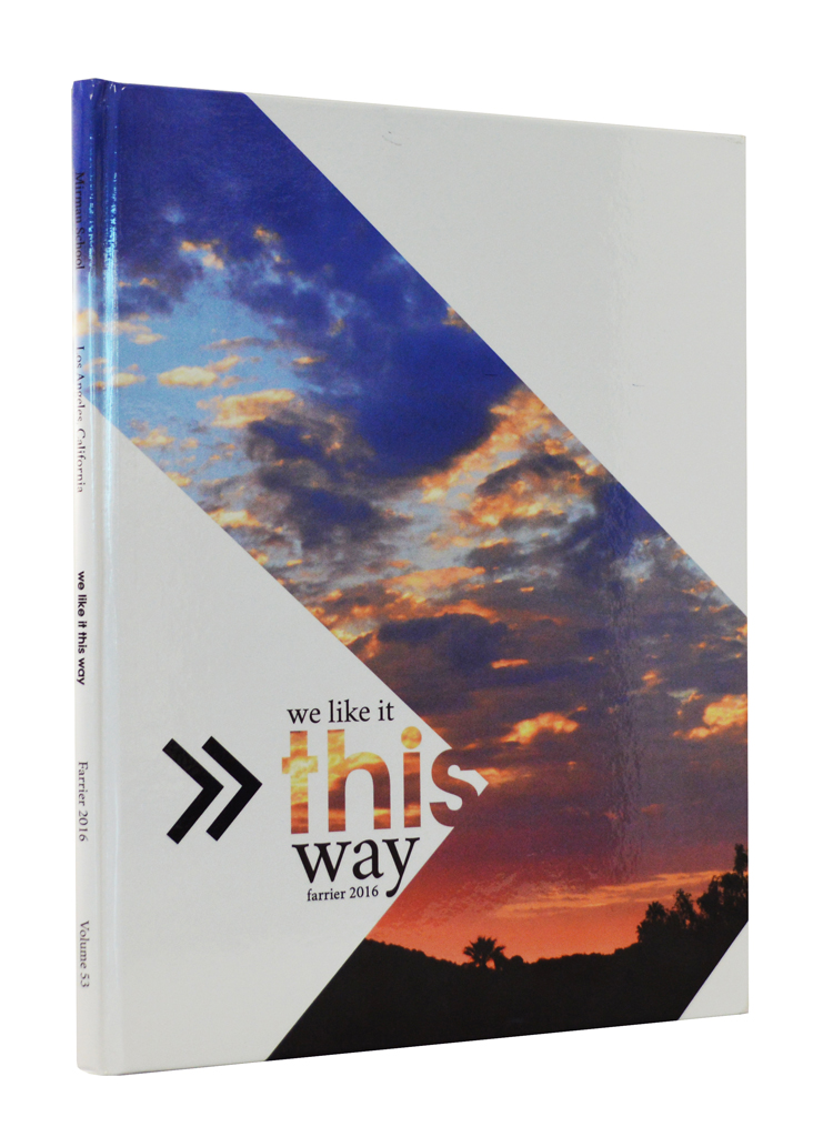
Farrier, Mirman School, Los Angeles, Calif.
Elena Saviano, Eva Wiener, Annie Beckman, Emmie Oertel, editors
Wendy Samson, adviser
We Like It This Way
From theme to photography, judges were full of praise when discussing the Pacemaker-winning Farrier.“Great photography throughout the yearbook’s 88 pages captures the essence of the year,” the judges said. “Strong coverage includes many student faces, names and meaningful quotes on the spreads.”
Theme development is strong from start to finish and graphics help establish the yearbook’s visual identity.
 |
 |
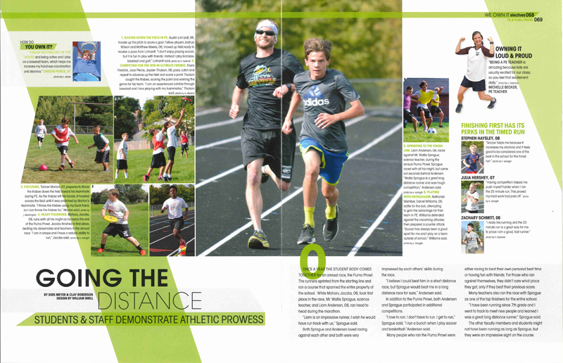 |
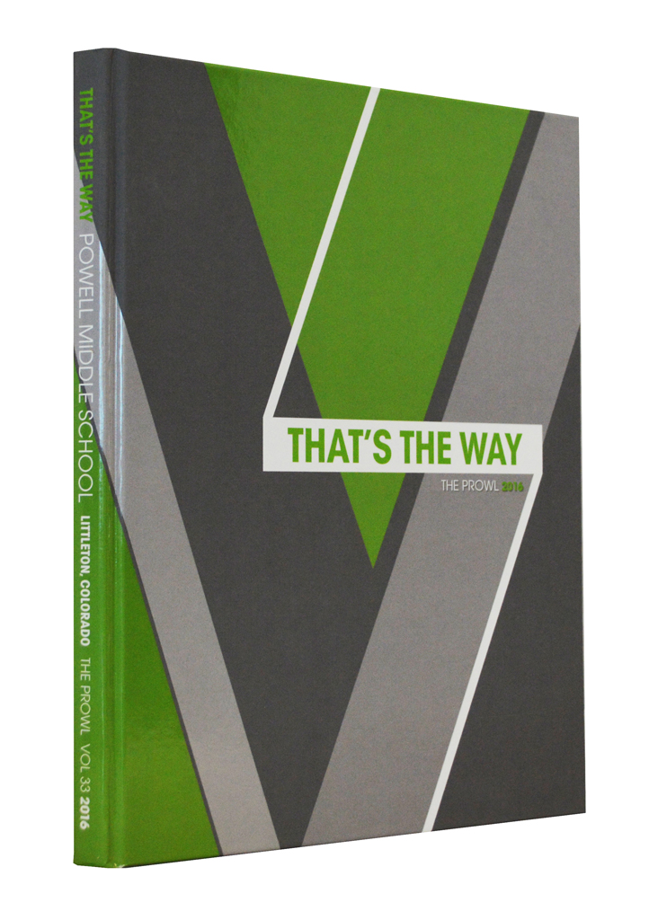
The Prowl, Powell MS, Littleton, Colo.
Senti Werden, Taylor Shives, Sophia Patrick, editors
Yvette Manculich, adviser
That’s the Way
A KC and the Sunshine Band song from the 1970s made a contemporary yearbook concept in 2016. The theme inspired three sections – we see it, we own it and we live it.“This fantastic yearbook features many examples of storytelling action photos, supported by complete captions,” the judges noted when discussing the Pacemaker-winning Prowl. They also noted the good continuity of design from the cover through the 144 inside pages.
 |
 |
 |
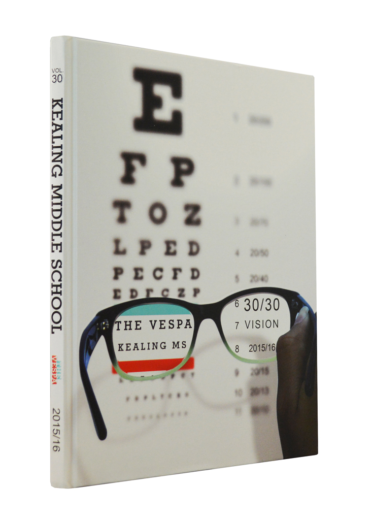
The Vespa, Kealing MS, Austin, Texas
Mira MacLaurin, editor
Kristen Scott, adviser
30/30 Vision
A strong theme set the stage for the Vespa to look forward and back as the school celebrated its 30th anniversary. Exemplary coverage defined this Pacemaker-winning yearbook.“Modular design allows for multiple levels of coverage on every spread,” the judges noted. “The modules use a wide variety of story formats and bring many names and faces to the pages.”
 |
 |
 |
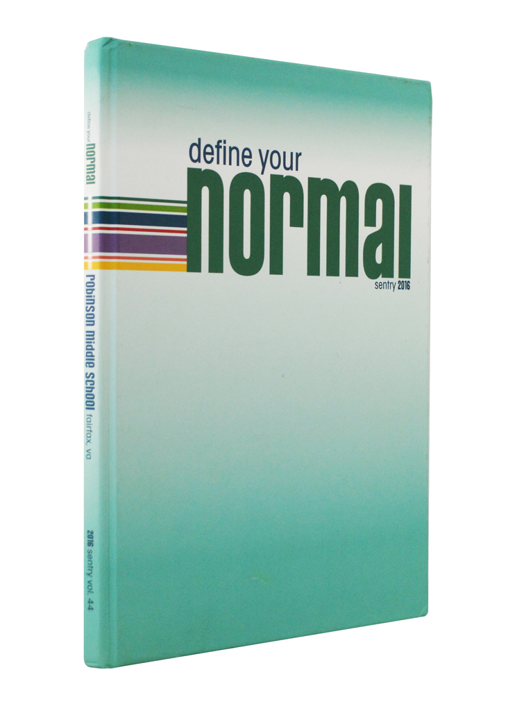
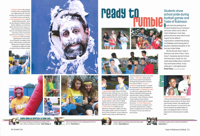
Sentry, Robinson MS, Fairfax, Va.
Owen Schwartz, Michaela Rudolph, editors
Adrienne Forte, adviser
Define Your Normal
“Strong theme development pushes the concept through the yearbook,” observed the judges who agreed the Sentry was definitely a Pacemaker winner.A whole-book link runs along the bottom of each spread greatly expanding coverage in this 124-page yearbook.
Judges also praised the use of typography and color.
232 or fewer pages
 |
 |
 |
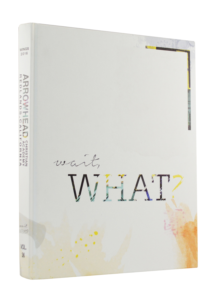
Wings, Arrowhead Christian Academy, Redlands, Calif.
Michalah Bell, Cassidy Brown, Sean Jackson, editors
Crystal Kazmierski, adviser
Wait, What?
“Classic design with contemporary touches” is how the judges described the Pacemaker-winning Wings. They also noted the strong verbal and visual voice the concept gives the yearbook citing the interesting conversational approach to writing engaging theme copy.Strong dominant images combined with carefully crafted headlines are a hallmark of Wings. Designs are clutter free and emphasis is placed on traditional feature story presentations to tell the story of the school’s 375 students. While consistency is established from spread to spread, each design takes on its own dynamic look.
Structurally, content flows freely throughout Wings, without traditional sections. Occasional theme spreads interrupt the coverage, serving as “connector” rather than “divider” spreads.
 |
 |
 |
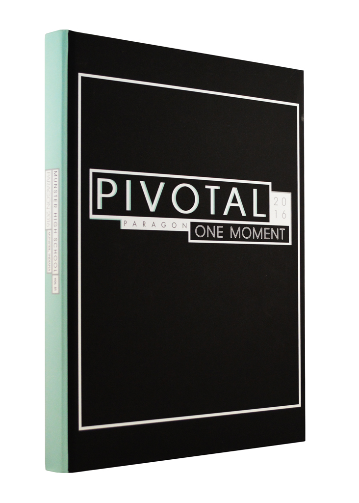
Paragon, Munster HS, Munster, Ind.
Lexie Lyons, Therese Capriglione, editors
Sarah-Anne Lanman, adviser
Pivotal One Moment
Judges praised the sophisticated verbal theme concept featured on the pages of the Paragon. “In 180 days of countless moments, we found ourselves within one moment – our moment. And, it was pivotal.”“The Paragon is marked by a nice balance of classic design with modern touches such as well-designed infographics,” the judges said. They also noted a “less is more” approach to color with the majority of the spreads appearing in black and white, with a mint green accent color used throughout the book as a visual unifier.
Great examples of headlines, stories and captions are evident throughout the book.
 |
 |
 |
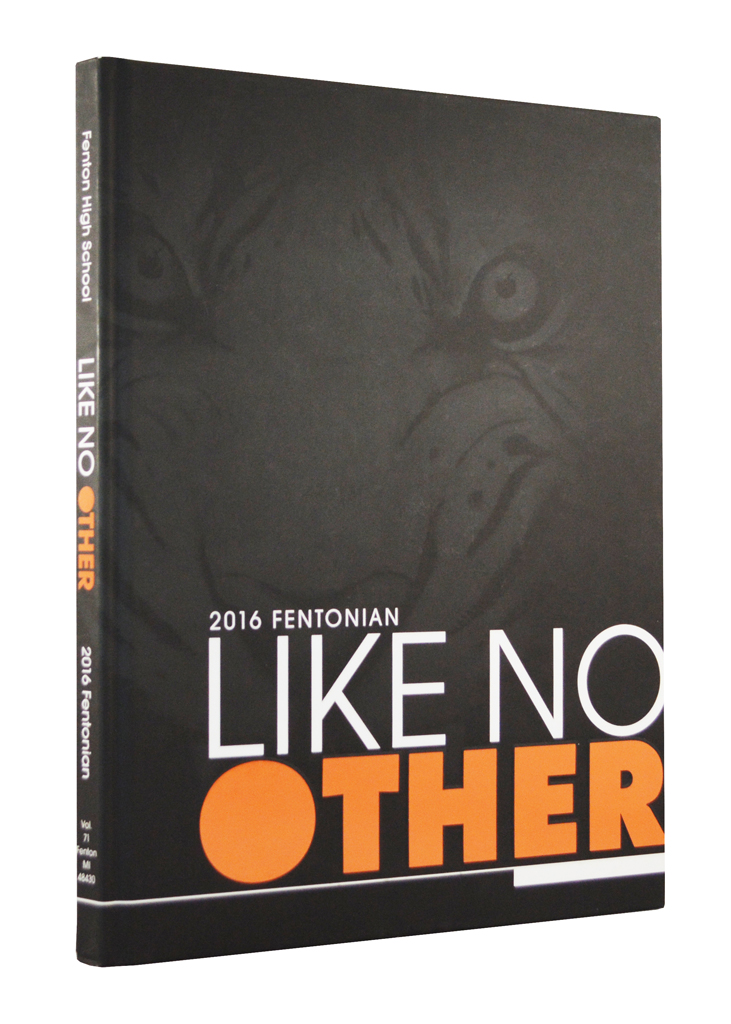
Fentonian, Fenton HS, Fenton, Mich.
Michael Fabatz, Hannah Swain, editors
Pamela Bunka, adviser
Like No Other
At the onset, the Fentonian staff set out to highlight the individuality of students and the collective accomplishments of clubs, organizations and teams. The staff succeeded while earning Pacemaker recognition.Judges praised the strong storytelling photography and noted the graphic elements introduced on the cover helped pull readers through the book.
The Fentonian reduced the amount of traditional stories used in the book, but placed greater emphasis on direct quotes. “Wow” spreads presented interesting feature topics in a creative design. The staff strategically placed these feature spreads between the lifestyle and sports sections to create separation within the chronological yearbook.
 |
 |
 |
PAWESEHI, Parkway West HS, Ballwin, Mo.
Maggie Walkoff, editor
Debra Klevens, adviser
Don’t Blink
Bold photography and typography combine to make a powerful theme statement. A blurred image on the cover transitions to a clear image on the front endsheet. And typographically, contrasting thin and heavy italic weights symbolize big, bold memories and small details that are easy to miss with a blink. The result is a yearbook with a strong visual voice.Judges referenced “exceptional action photography combined with effective use of planned white space” to give designs strong impact. Color, pulled from the dominant images, echoes across the spreads in the main headline and module headlines for visual unity.
Interesting story presentations and strong use of quotes foster strong storytelling throughout this Pacemaker winner.
 |
 |
 |
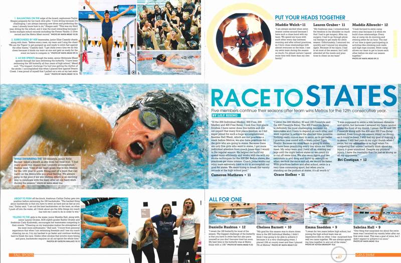
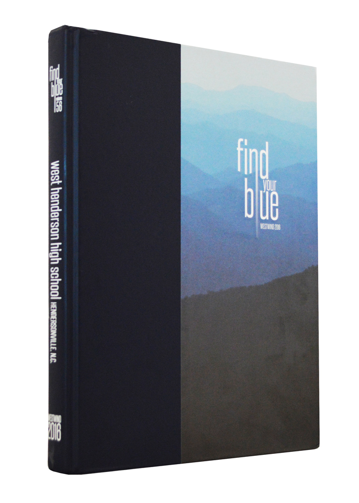
Westwind, West Henderson HS, Hendersonville, N.C.
Izzy Denman, Juliana Goode, Lauren Heywood, editors
Brenda W. Gorsuch, adviser
Find Your Blue
Nestled in the Blue Ridge Mountains, the concept of the Westwind captures pride in their surroundings and pride in their school, which features blue as one of its colors. The story of the year is divided into four sections – finding your Pride, Voice, Passion and Way.The judges noted how the concept touched all parts of the Pacemaker yearbook, pointing out how the sophisticated typography treatments supported the theme while unifying the entire book.
A magazine insert, printed on smaller pages, profiles interesting student personalities. A continuous quote presentation expands coverage as it repeats on spread after spread. And, “scatter spreads” break up the routine while presenting interesting features.
 |
 |
 |
Hoofbeats, Burges HS, El Paso, Texas
Jordan Steyer, Jasmine Tabler, editors
Patricia Monroe, adviser
Things Happen
While it was the school’s 60th anniversary, the Hoofbeats staff wisely kept its coverage focused on the current year, but did feature a few photos from the past on the dividers along with historical facts in the people section and the index.“Storytelling reporting highlights this book with a variety of formats adding to content,” said the judges who also cited “super” photos as noteworthy in this Pacemaker-winning yearbook.
Designers employed stripes, shaded bars and blocking to visually unify the book. Polarized black-and-white cutout photos of athletes were used on every sports spread.
 |
 |
 |
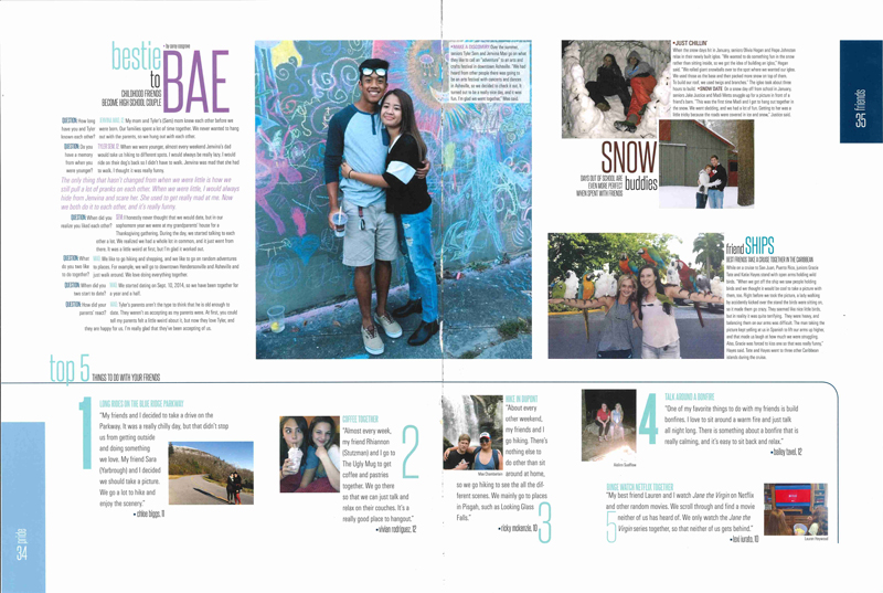
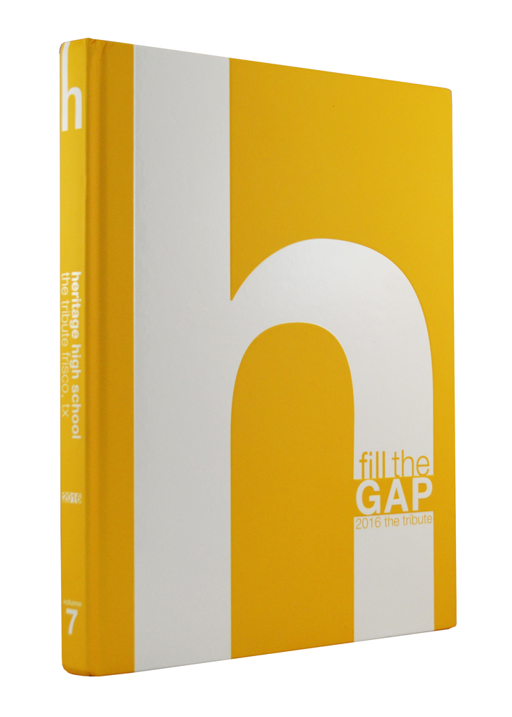
The Tribute, Heritage HS, Frisco, Texas
Stephanie Morse, Tanya Masike, editors
Rebecca Pollard, adviser
Fill the Gap
A strong concept set the stage for the Tribute to cover not only big events, but to also focus on the little moments that define the year and make up the high school experience for the every student.“The staff has paid attention to details to make it an outstanding publication – design and typography shine,” noted the judges.
Also, strong verbal theme connections, bold contemporary design and typography and creative content modules further set the Tribute apart.
 |
 |
 |
Aquila, Freedom HS, South Riding, Va.
Elena Becker, Emily Kim, Victoria Frank, Makeez Sadozai, Ethan Price, Priyanka Bitra, editors
Katheryn Hans, adviser
Wait. You’re Gonna Need This.
Exemplary color and typographic choices set the Aquila apart. The judges said that strong coverage throughout the Aquila features comprehensive verbal storytelling – in captions, stories and headlines.The Aqulia features an umbrella approach to coverage with each spread defining the “THIS” of the theme. In the bottom-right corner, the topics covered are itemized. There aren’t any traditional sports, student life or reference spreads.
The “Wait What?” quote presentation unifies the yearbook by presenting a theme-related, storytelling quote on each spread trademarked by the theme colors.
233-288 pages
 |
 |
 |
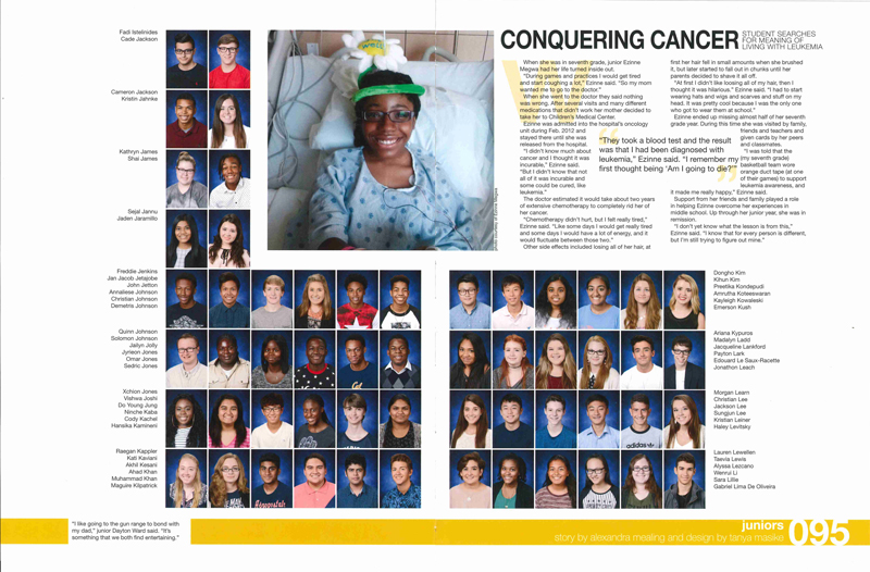
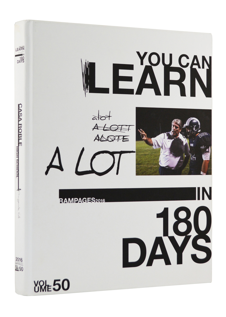
Rampages, Casa Roble HS, Orangevale, Calif.
Carson Burns, Josh Jordan, Allana Rogers, Anelise Wyanat, editors
Dan Austin, adviser
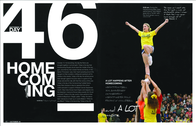
You Can Learn A Lot in 180 Days
Strong theme development – both verbally and visually – helped Rampages earn Pacemaker honors. The concept becomes the platform for covering the year from a fresh perspective. Storytelling is organized chronologically by day.A “What Did You Learn Today?” quote presentation expands coverage and runs continuously throughout the book featuring insightful student quotes from each of the 180 days.
Bold spreads with black backgrounds and oversized numbers highlight eight key days and dramatically reinforce the daily format.
A “You Can Learn A Lot in 50 Years” specialty magazine provides appropriate concept-driven coverage of the school anniversary.
 |
 |
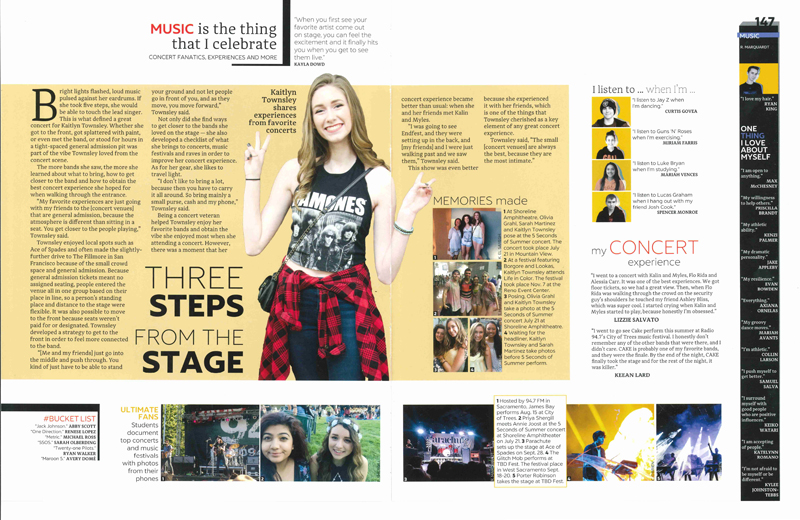 |
Details, Whitney HS, Rocklin, Calif.
Megan Green, Abigail Hammond, editors
Sarah Nichols, adviser
More is Our Thing
Details didn’t just feature more coverage, it delivered innovative journalistic approaches to storytelling.An eight-page in-depth section called “Music is the Thing” showcased traditional long-form feature profiles as centerpiece modules.
Another in-depth section, called “More or Less,” provides an antidotal and statistical look at news and trends with content gathered by engaging 359 readers with online polls. This great example of data journalism is reported with professional quality infographics.
A four-page “Things To Consider” section uses opinion writing to localize and personalize current events with reader-submitted content.
A concept-related vertical folio bar runs continuously on edge of each spread, adding at least 1,380 student voices. And, two mini tip-ins engage readers with fun foldouts presented as part of the life and sport dividers.
 |
 |
 |
Jabberwokk, Darlington School, Rome, Ga.
Ethan Pender, Selena Chen, editors
Adrienne L. Forgette, adviser
You Know What
When creating a yearbook, details matter. And this attention to detail resulted in a Pacemaker for the Jabberwokk.The concept drives all the verbal and visual details. The bold theme is conversational and works as either a question or statement. It also drives the yearbook’s three sections — You, Know, What.
Because details matter, there are three opening spreads. And, the subtle use of a triangle becomes a visual unifier because not only does it have three sides, a triangle appears in the center of the school crest and represents the school’s three divisions.
While the judges were impressed with visual decisions such as typographic and color choices, content also matters: “We were particularly impressed with the strong coverage for a K-12 school.”
 |
 |
 |
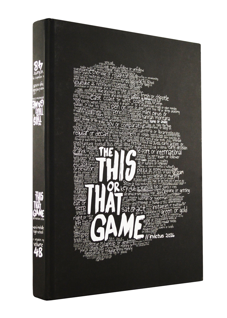
Invictus, Ward Melville HS, East Setauket, N.Y.
Michele Moloney, editor
Cortney Weisman, adviser
The This or That Game
A creative theme engages teen readers with its playful approach while impressing the judges with how the concept accents the design of every spread. The theme is presented on both the front and the back covers and forces the reader to decide which way to open the book. Choices are sprinkled throughout the book, with a game hidden within some of the folios. Only one path leads the reader to the end.A bold, handwritten font, often accented with color, is a critical visual unifier echoed throughout the book for headline treatments, module headlines and quote presentations.
A strong variety of content modules are not only well designed, they offer a wide variety of storytelling formats.
 |
 |
 |
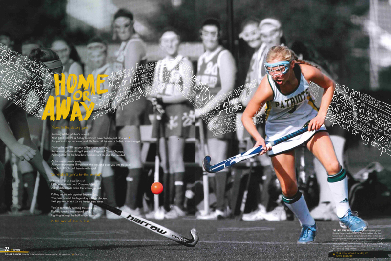
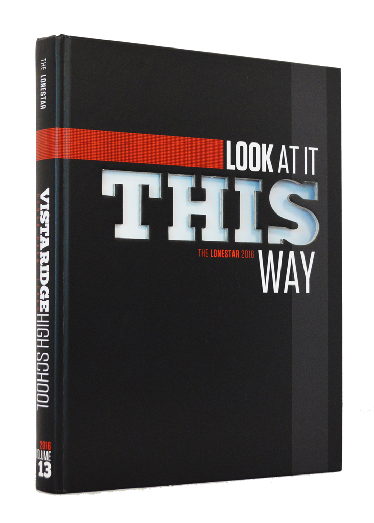
The Lonestar, Vista Ridge HS, Cedar Park, Texas
Halee Jorgensen, Kira Virgil, editors
Jamie Ray, adviser
Look at it THIS Way
The strong coverage packages featured on the pages of the Lonestar wowed the judges who noted that student-focused coverage started on the front endsheet and continued all the way through the index. As a result, the book is packed with lots of student voices.While the spreads are packed with content, the use of white space, typography and color give the yearbook a contemporary look without being cluttered or busy.
A quote presentation, running along the bottom of every spread, serves as a stylish graphic unifier while delivering meaningful quotes and mug shots of approximately 240 students.
 |
 |
 |
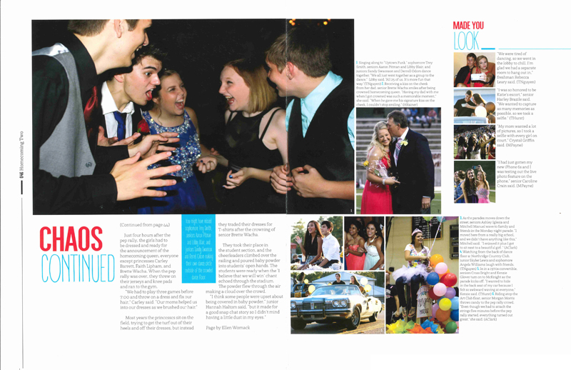
The Hawk, Pleasant Grove HS, Texarkana, Texas
Carolina Crain, Lauren Davis, Lauren Allison, Kenzie Glover, editors
Charla Harris, adviser
Don’t Blink You’ll Miss Something
The Hawk does more than report the obvious by digging for details and presenting secondary coverage packages featuring the little stories that often go unreported. This approach to reporting and coverage teamed nicely with the yearbook’s concept, resulting in many layers of rich storytelling.Instead of using a sectional approach to organization, the story of the year flows in a loose chronological presentation interrupted occasionally by four foldouts. Starting with a big photo and a story, each foldout literally reveals hidden stories behind the big story unified by the headline: “If You Blinked … You Missed … This.”
Judges also praised the well-designed reference spreads featuring group shots supplemented interesting story packages.
 |
 |
 |
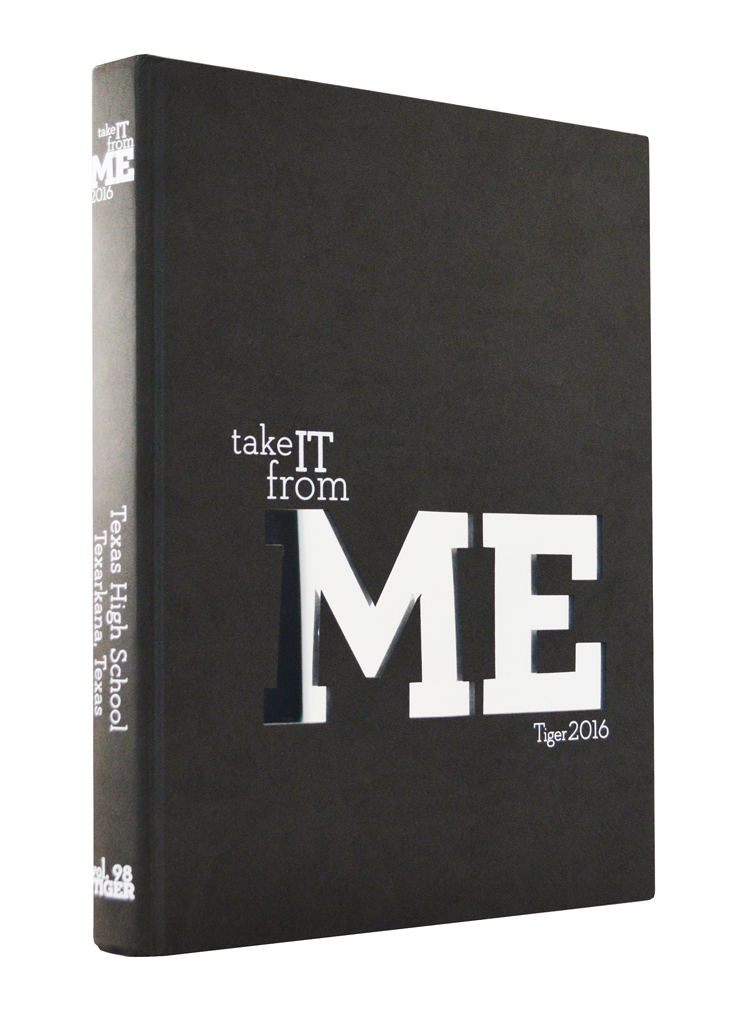
Tiger, Texas HS, Texarkana, Texas
Madison Maynard, Colleen Russell, Elizabeth Tullis, editors
Rebecca Potter/Clint Smith, advisers
Take It From Me
Exceptionally strong photography, capturing storytelling moments, is a trademark of a Pacemaker-winning yearbook. And according to the judges, the Tiger sets the pace.A clean, contemporary design employs white space to let the images breathe and to command the attention they deserve. Dominance is clearly established for the centerpiece image on each spread.
Creative and unique content modules result in visually interesting spreads with strong coverage. Color accents the content rather than randomly painting the pages.
Storytelling quotes, in both stories and captions, contribute interesting verbal stories without repeating what is obvious in the images.
 |
 |
 |
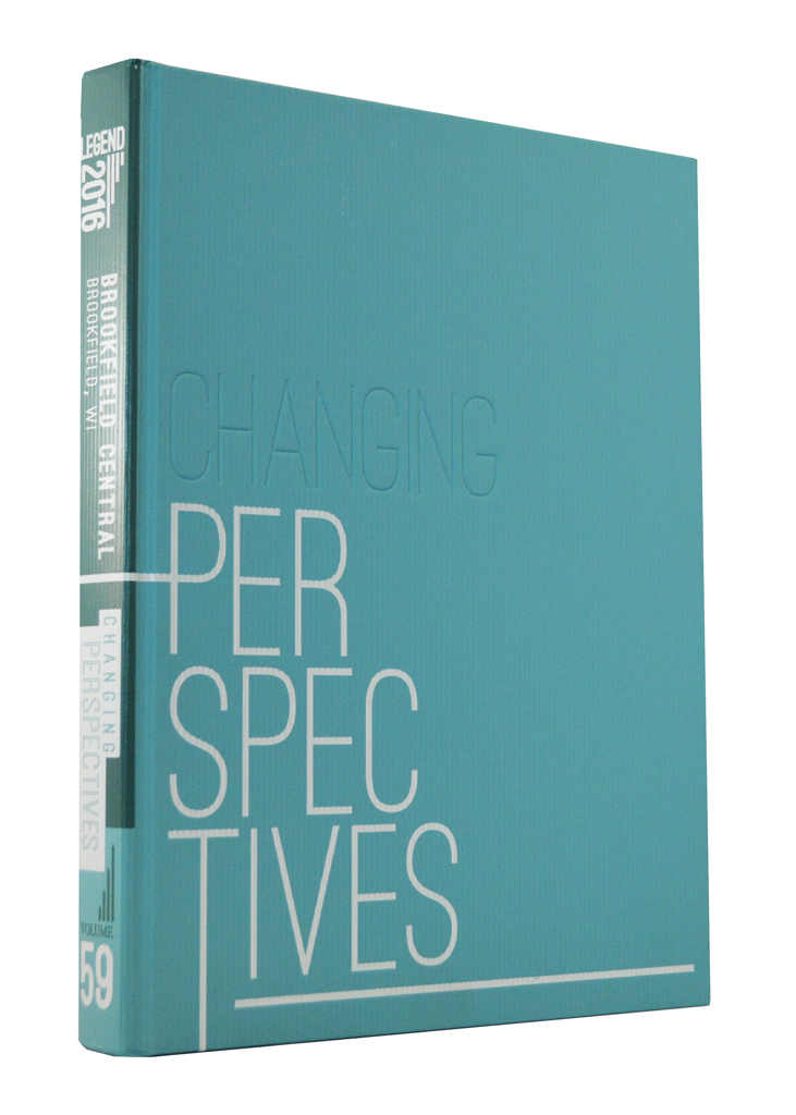
Legend, Brookfield Central HS, Brookfield, Wis.
Emma Kumer, editor
Tom Juran, adviser
Changing Perspectives
A fresh visual approach to yearbook design set the Legend apart and caught the eye of the Pacemaker judges.A unique cover design and dynamic opening spread, featuring a full-bleed photo with interesting typography, visually supports the “Changing Perspectives” theme.
Judges referenced the yearbook’s graphic presentation and noted the sophisticated color and typographic choices of the student designers as well as strong photography. The headlines not only looked good, they were clever in their verbal messaging.
289-336 pages
 |
 |
 |
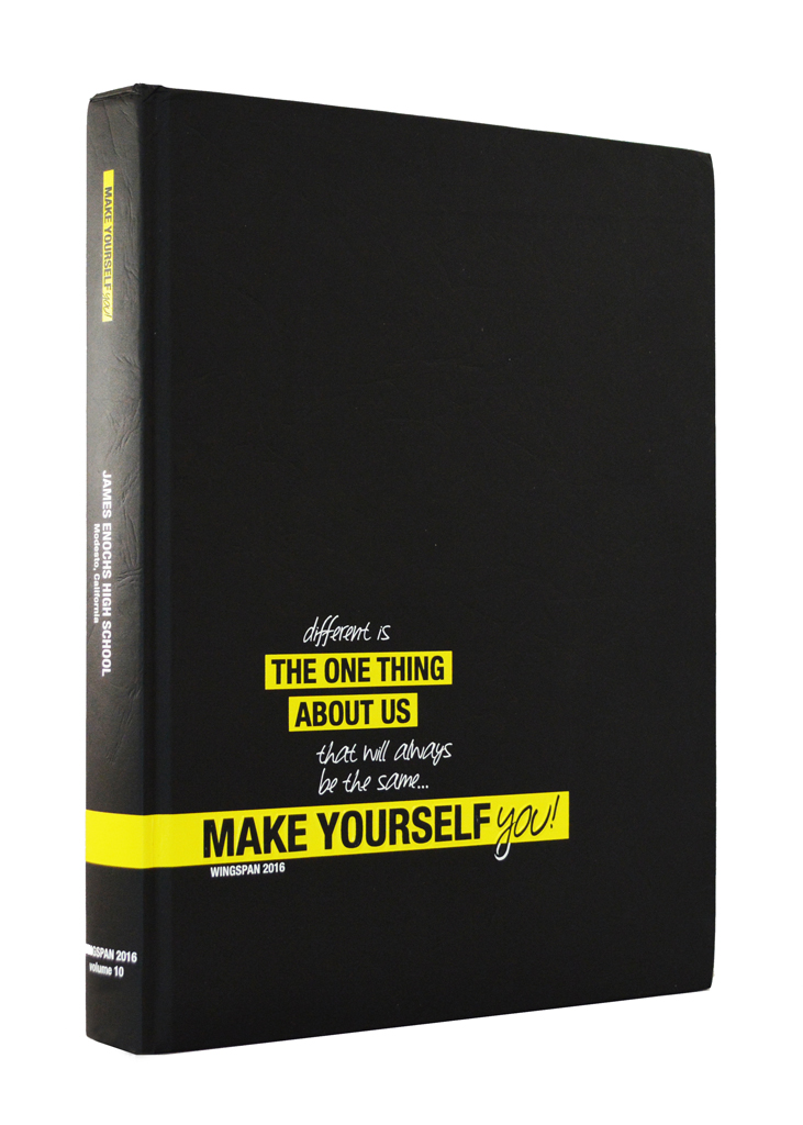
Wingspan, James C. Enochs HS, Modesto, Calif.
Elysia Houston, Kimber Hale, Joscelyn Pardo, editors
Tamra McCarthy, adviser
Make Yourself You
Inspired by the Apple “Think Different” campaign, the Wingspan used its concept to embrace the differences at their school by pointing out that being different is really what unified their students.The judges noted the theme, with its powerful images and expressive copy, gives the Wingspan “an authentic student voice.” And on virtually every spread, a powerful visual-verbal connection is established.
A “whole book look” visually unifies all 332 pages. Headlines throughout the book are designed using a bold, all-cap sans serif font paired with a handwritten font used sparingly for contrast. Color bars and modules are accented with yellow and pop off the page.
 |
 |
 |
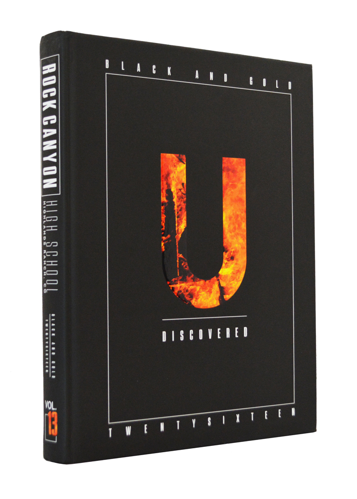
The Black and Gold, Rock Canyon HS, Highlands Ranch, Colo.
Celia Adams, Emma Haworth, Azile Nelson, editors
Kristi Rathbun, adviser
U Discovered
A unique concept provided a storytelling platform that resulted in the storytelling quotes presented in the “U” modules, a continuous element appearing on every spread. “Viewpoint” modules appear when appropriate to allow students voices on issues.Like many Pacemaker winners, the concept also shaped the yearbook’s coverage. The staff created a 16-page profile section featuring interesting students and their stories.
To further expand coverage, each section opens with a trends spread providing student insights on contemporary topics ranging from Snapchat filters to the election debates to music. The bold design features interesting approaches to storytelling.
 |
 |
 |
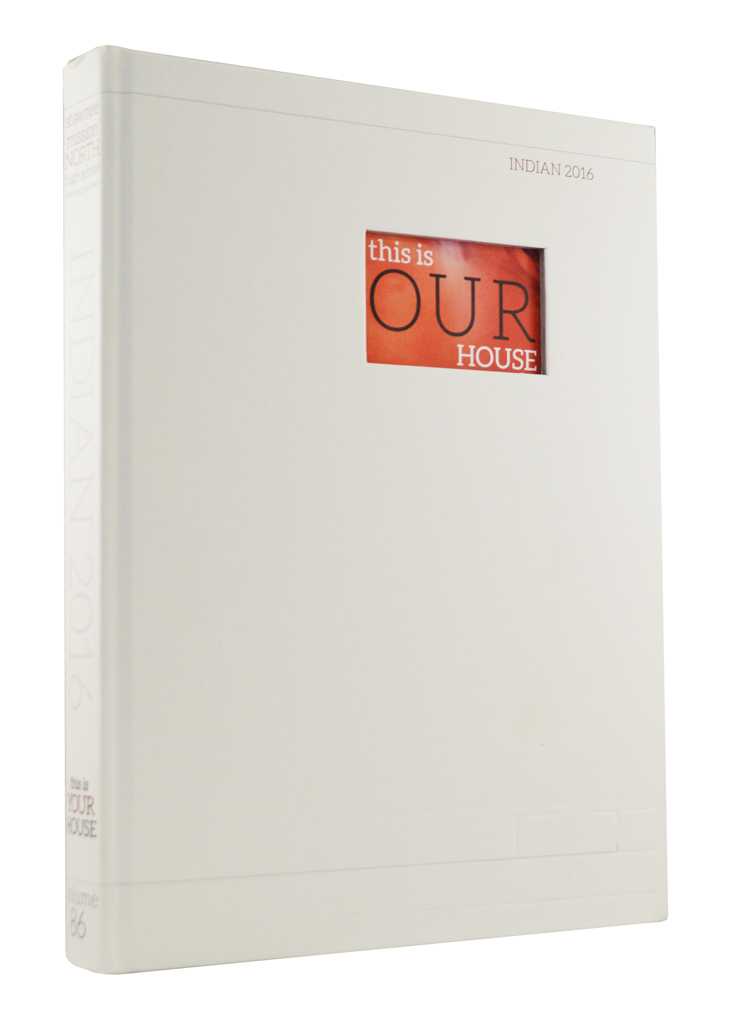
Indian, Shawnee Mission North HS, Overland Park, Kan.
Mariana Orrego, Shannon Wray, editors
Becky Tate, adviser
This is Your House
The judges repeatedly used the word “wow” when discussing this yearbook. The word was first used to describe the opening section where powerful full-bleed images and a few carefully crafted words launched the theme.“Extreme economy of words teamed with wow photography in the opening creates an impressive impact,” the judges said.
On page after page, powerful verbal and visual storytelling wow the readers with sidebars offering precise detail. A content-driven approach to design avoids the visual redundancy that results when yearbooks rely heavily on templates. And while the designs vary significantly from spread to spread, they are visually unified.
 |
 |
 |
The Arena, Legacy HS, Mansfield, Texas
Brooke Jackson, editor
Leland Mallett/Rachel Dearinger, advisers
As In
The Arena staff set a goal to go beyond surface of the school with their coverage, placing an emphasis on individuals and their unique stories while focusing on details. This emphasis on coverage paid off.Small, square mini-magazines were attached to each divider offering readers an “Insider” view of the school, clubs and teams.
“Fresh coverage. We are sure the student body loved this yearbook,” the judges said. “This book establishes some new trends in coverage.”
The judges also praised the content-driven design. “The yearbook has a strong visual vocabulary – the design changes on every spread while remaining consistent.”
 |
 |
 |
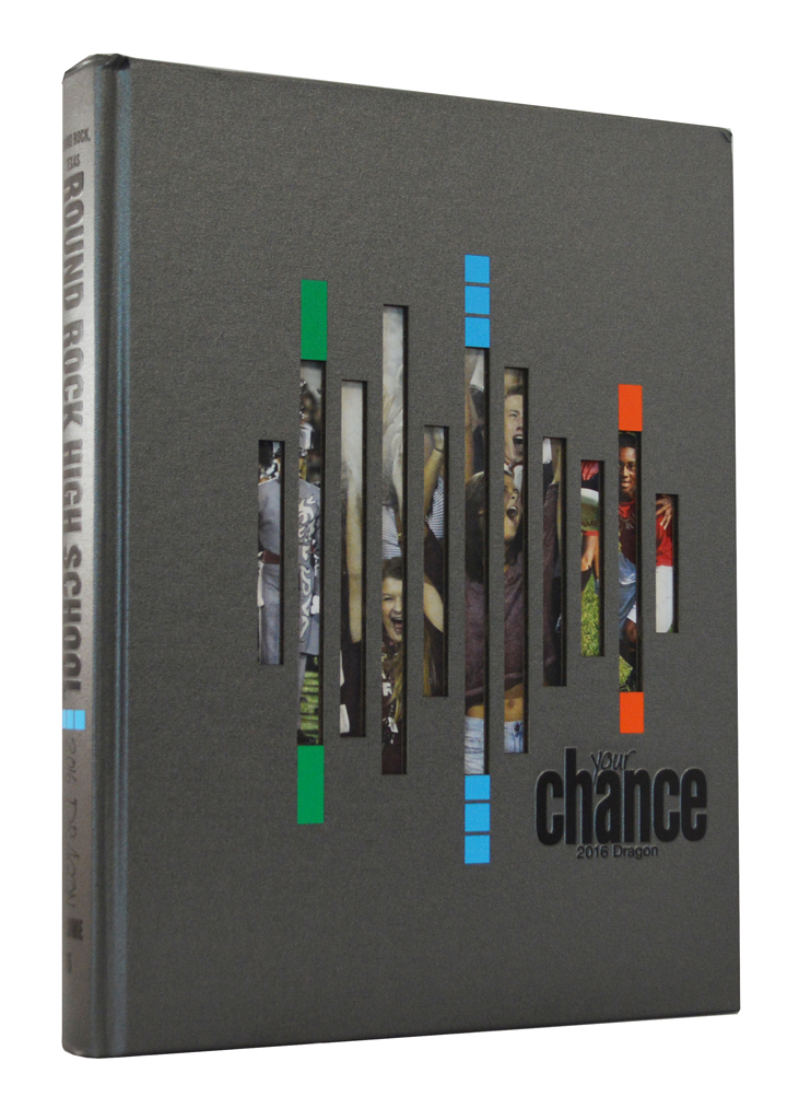
Dragon, Round Rock HS, Round Rock, Texas
Faye McKerlie, Sophia Smith, editors
Sharon Kubicek, adviser
Your Chance to be Seen and Heard
A dramatic cover and endsheet presentation makes the theme statement in a bold way. The die-cut cover previews portions of photographs on the endsheet. A dramatic endsheet foldout literally spells out the theme in three parts, displaying the word “HEARD” so it is huge and supported by storytelling quotes.“Contemporary typography and clean design actuate the verbal-visual development,” the judges noted. They also noted the expansive and varied coverage throughout the Dragon.
Using a seasonal approach to presenting the content, the staff successfully moved sports coverage into the chronological presentation for the first time, abandoning a traditional sports section and expanding coverage.
 |
 |
 |
Lair, Lake Braddock HS, Burke, Va.
Jake Gold, Samantha Hernandez, Christopher Margraf, editors
Kathryn Helmke, adviser
Life Won’t Slow Down You Better Keep Up
“Fabulous candid photography that captures peak moments,” caught the eyes of the judges as they studied The Lair. Not only is the photography strong, designers were not shy about making the dominant photos significantly larger, creating spreads with a clear center of visual impact.The powerful photo arrangements are enhanced by extensive use of content modules that are noteworthy both in terms of design and storytelling approaches.
Exceptional storytelling captions take the place of traditional feature stories on most spreads. And, headlines are exceptional. Clever primary headlines, featuring a key emphasis word, pair with secondary headlines to provide catchy verbal packages that delivers specific information.
 |
 |
 |
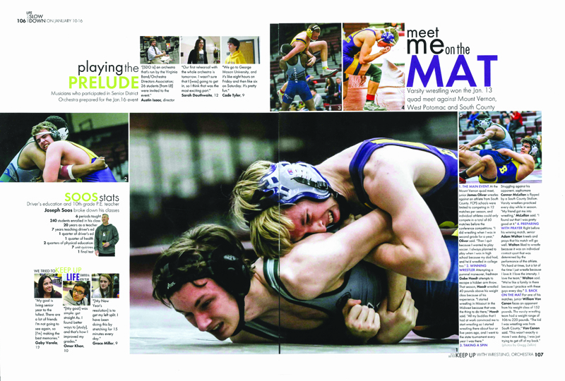
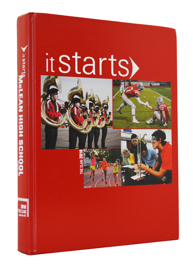
The Clan, McLean HS, McLean, Va.
Allie Babyak, Grace Fabrycky, Karen Shedlock, Isabelle Wyerman, Anthony Capon, Christine O’Donnell, editors
Meghan Percival, adviser
It Starts
Innovative and contemporary theme development impressed the judges who commented on how the concept touches every aspect of The Clan in a detailed and thoughtful way.The concept drives the format of the theme copy and captions. It also touches every spread with an “all coverage device” which asks a question that links the content of the spread to the concept.
Rather than traditional yearbook divisions, the theme inspired four unique and blended sections. Within theses sections, innovative “interrupter” spreads change the pace and provide more theme-driven coverage.
In addition to the innovative concept development, clever coverage and great photography were also specifically noted by the judges.
 |
 |
 |
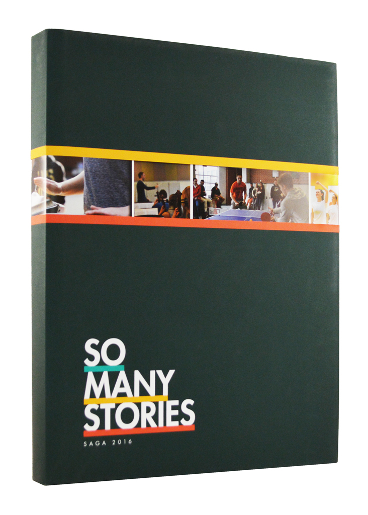
Saga, Loudoun Valley HS, Purcellville, Va.
Danielle Anderson, Katie Weems, Francheska Molina, Parrish Alto, editors
Martha Akers, adviser
So Many Stories
The Saga editors surveyed the school community and learned that family, learning, social media, creativity and community were important to their readers. And as a result, coverage focused on these areas with each given an icon and a spread in the opening section. A whole-book coverage bar featured storytelling quotes focusing on each of these areas.As a special reader surprise, the Saga is wrapped in a dust jacket that unfolds into a dramatic poster providing so many stories.
The judges cited “impressive coverage from detail modules to awesome special features” as trademarks of this Pacemaker winner. “Clean design lets the content pop off the page,” they noted.
 |
 |
 |
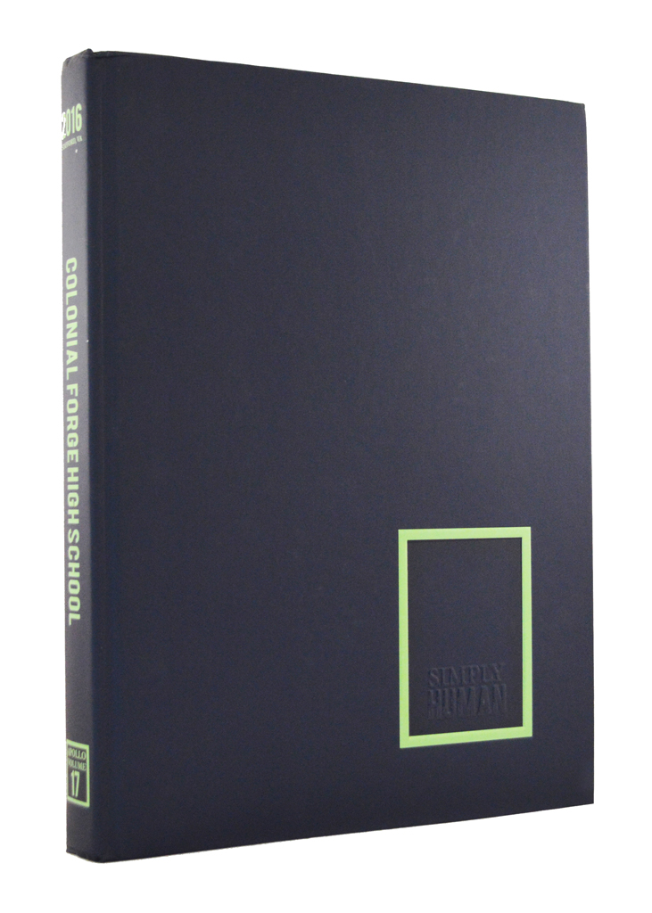
The Apollo, Colonial Forge HS, Stafford, Va.
Emily Gingerich, Kennedy Buechner, Jeremy Hayward, Emily Bartenfelder, editors
Tiffany Kopcak, adviser
Simply Human
“Bold and innovative” is how the judges described The Apollo. The staff sought to capture the diversity of their school and to let people tell their own stories. Their success is obvious. Judges noted “so many unique student voices throughout the book.”The staff was inspired by the Humans of New York and National Geographic magazine in creating their unique journalistic voice.
“Coverage dictates design as modules change per topic, yet they remain consistent in overall look,” noted the judges.
Trendsetting coverage results from six unique, in-depth sections presented in the first half of the book followed by traditional sports, people and clubs sections.
337 or more pages
 |
 |
 |
Ursus, Granite Bay HS, Granite Bay, Calif.
Ambreen Siddiqui, editor
Bernadette Cranmer, adviser
This Book is About You
A bold concept that gave the Ursus a strong personality, while greatly expanding student coverage, earned rave reviews from the Pacemaker judges.“The Ursus is an exemplary example of theme development – both verbally and visually,” the judges said. “A whole-book folio bar on every spread profiles a student while featuring meaningful quotes from three others.”
Starting on the cover and continuing on every spread, statements were edited in bold, red handwriting to make them more personal. This combined with a traditional approach to typography, appropriate for a classic, 20th anniversary volume.
Judges also referenced a variety of story formats with strong leads and great photography.
 |
 |
 |
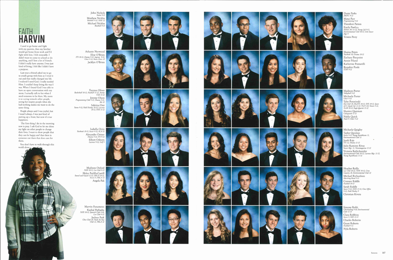
Legend, William R. Boone HS, Orlando, Fla.
Matt Casler, Emma McClane, editors
Renée Burke, adviser
You Just Don’t Know Us
Everyone has a story to tell and the Legend used its theme as a platform to dig deeper and go beyond the school’s identity to capture rich individual experiences. As a result, the judges were impressed with the yearbook’s depth of coverage. “Super photos, strong reporting and engaging writing is unified with a strong theme, making this yearbook a Pacemaker,” the judges noted.Without using traditional sections, content flows naturally through the Legend with “You Need to Know” profile spreads weaving personal stories throughout the collective coverage. As a reader service, the table of contents outlines the content by traditional content areas – student life, people, community, sports, clubs and academics.
 |
 |
 |
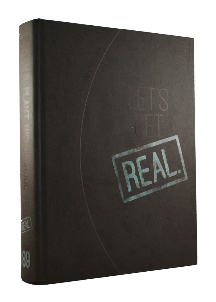
Panther, H.B. Plant HS, Tampa, Fla.
Carson Collins, Katie Martin, editors
Christina Porcelli, adviser
Let’s Get Real
Comprehensive reporting definitely got real when the Panther implemented a chronological approach to coverage by dividing the book into monthly sections with most weeks receiving three spreads. And, the Pacemaker judges noticed.“Chronological organization gives this yearbook amazing coverage opportunities,” the judging team noted. “Well-designed modules on every spread cover a wide variety of modules.”
The concept also gives the Panther a strong voice and introduces visual elements that are skillfully repeated throughout this yearbook’s 522 pages.
 |
 |
 |
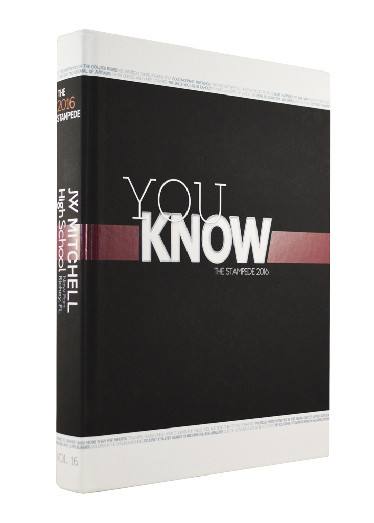
The Stampede, J.W. Mitchell HS, Trinity, Fla.
Alexa Rosenberg, editor
Susan McNulty, adviser
You Know
In a year without major changes happening on campus, The Stampede staff opted to focus on all the things that students may already know. Beginning on the cover, text wrapped from the front to the back, highlighting all the big and little things that define the school.The text bars across the cover and dividers make a powerful verbal/visual connection for the readers.
In addition to the text bars, the vertical photo design introduced on the front endsheet and on several theme spreads throughout the book add quotes above the photos to increase coverage.
Judges noted the content of The Stampede “offered something for everyone” and praised the yearbook’s clean, classic design, strong coverage and dynamic headline presentations.
 |
 |
 |
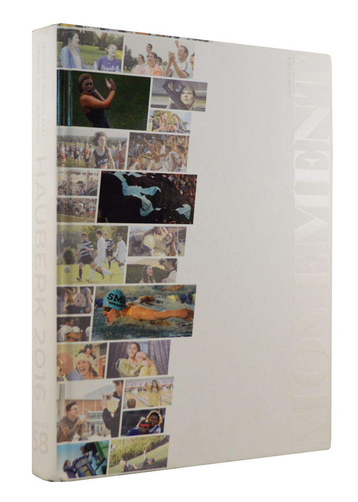
Hauberk, Shawnee Mission East HS, Prairie Village, Kan.
Audrey Dickens, Becca Pfeifauf, editors
C. Dow Tate, adviser
Movement
From lighter topics like fashion and social media to sensitive stories like sexual assault and drinking, the Pacemaker-winning Hauberk defines 21st century yearbook journalism with its spectacular photography and reporting.“A great photographic cover, with captions on the inside, instantly creates reader interest for the 532 pages of quality journalism that follows,” noted the judges.
The Hauberk is organized with monthly sections followed by the portraits and group shots. In-depth features appear throughout the monthly chronology and 10 fascinating in-depth profile spreads break-up the portrait pages.
 |
 |
 |
Lair, Shawnee Mission Northwest HS, Shawnee, Kan.
Jordan Arnold, Kaleigh Schreiber, editors
Susan Massy, adviser
Yours Truly
The judging team couldn’t say enough good things about the Pacemaker-winning Lair. “The creative theme provides a strong look into the school year, highlighted by personal stories and dynamic photos,” the judges said. “We love how typography plays such a significant role in the book’s presentation.”Content throughout the 400 pages is presented in a free-flowing arrangement without traditional sections or dividers. A detailed contents listing, with content outlined by traditional yearbook categories, helps readers locate specific topics.
The Lair makes trendsetting use of depth design in which some topics are presented in packages of two or three spreads.
 |
 |
 |
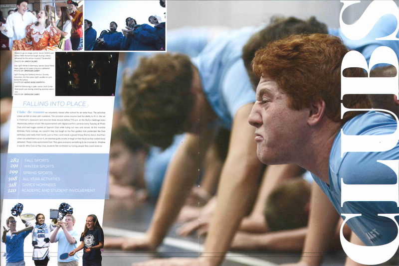
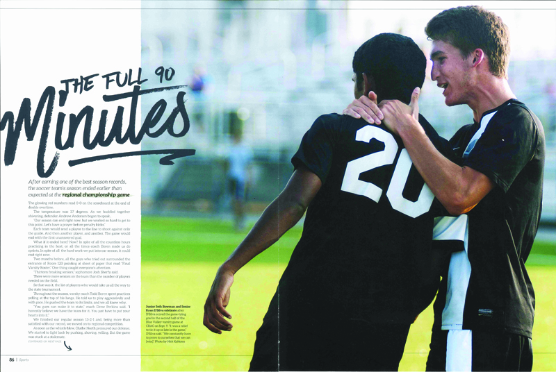
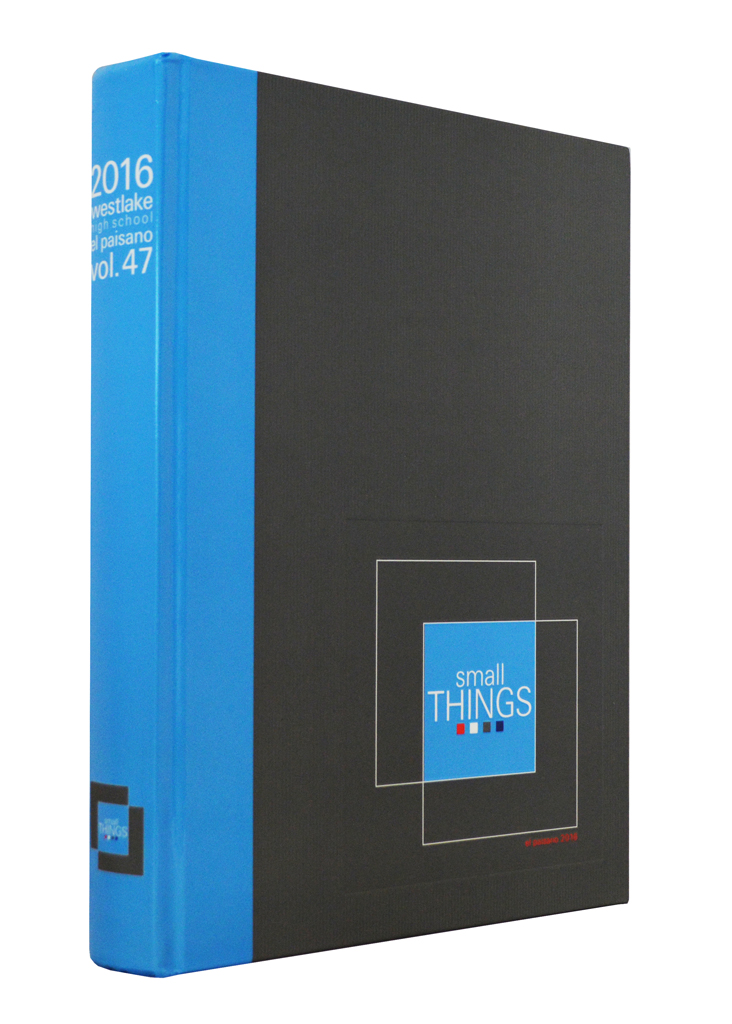
El Paisano, Westlake HS, Austin, Texas
Jesse Olguin, Megan Rizzi, editors
Cindy Todd, adviser
Small Things
The judging team raved about the El Paisano: “Storytelling photos. Beautiful design. Strong copy. Engaging headlines. All of these combine to create an incredible yearbook.”Divider spreads, featuring stunning full-spread bleed photos, make a powerful statement throughout the book, focusing on small things, but in a large dramatic way.
Judges noted the yearbook’s “clean uncluttered” design, placing emphasis on powerful dominant photos as a center of visual impact on each spread with secondary images and content modules as supporting content. Expanded and tight spacing are used effectively for packaging the content.
 |
 |
 |
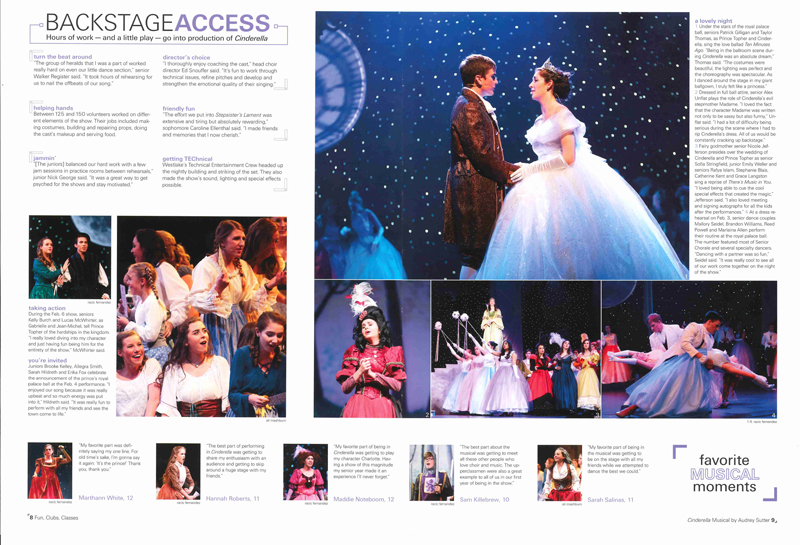
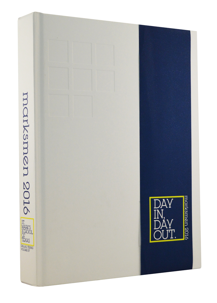
Marksmen, St. Mark’s School of Texas, Dallas, Texas
Will Diamond, editor
Ray Westbrook, adviser
Day In, Day Out.
“Sophisticated” is a word the judges used frequently when discussing the Pacemaker-winning Marksmen. Sophisticated typography, graphics and color usage set this book apart.“Layers of coverage on uncluttered spreads give this sophisticated yearbook a clean ‘look at me’ vibe,” noted the judging team. “Exemplary” thematic development was also cited.
Trendsetting, in-depth magazine packages appear five times throughout the Marksmen. Each in-depth package features four pages, visually unified by similar design elements, color and the use of black-and-white images.
 |
 |
 |
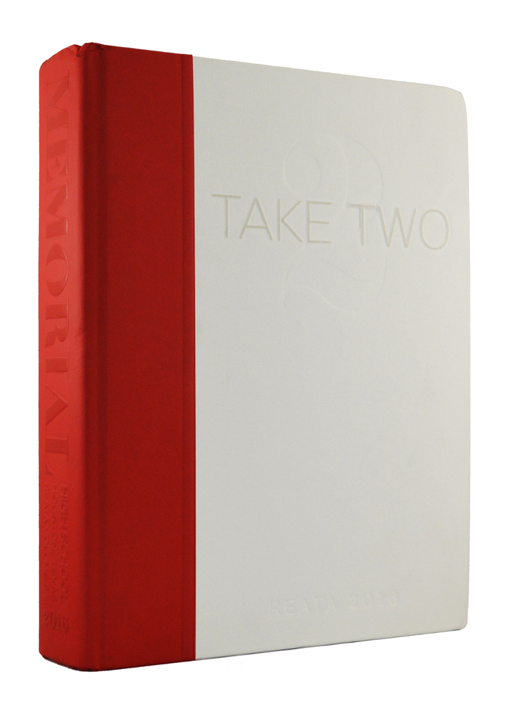
Reata, Memorial HS, Houston, Texas
Caroline Jones, Aniston Hill, Emma Keller, editors
Holly Hartman, adviser
Take Two
A change in the school schedule, involving taking two minutes from each class and one minute from each passing period, inspired a contemporary theme that uniquely fit the Reata. The concept shaped the book’s organization with two major sections – life and people and also inspired a quote presentation on the left corner of each spread.The two major sections were physically separated by a dazzling “From Day One” mini-magazine calendar insert in which the staff reported something significant for each of the 285 days of the academic year. While many of the daily reports were school focused, news and pop culture was also featured.
In addition to the concept, judges observed noted that typographic selections gave the yearbook a strong visual voice.
 |
 |
 |
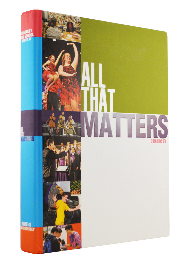
Odyssey, Chantilly HS, Chantilly, Va.
Christinae Ly, Kali Milazzo, Elise Mazzone, editors
Mary Kay Downes, adviser
All That Matters
“A great cover leads the reader inside to a well-designed, well-written and photographically pleasing yearbook,” the judges said in praising the Pacemaker-winning Odyssey.The Odyssey editors wanted their yearbook to be inclusive, but took their coverage goal a step further. Rather than just being in the book, the editors set out to feature students in stories that mattered using “We All Matter” as continuing coverage device that appears vertically or horizontally.
Judges also noted the yearbook’s outstanding headlines with size and color used to emphasize a key “pop-out word.” Headlines for secondary modules echo the design of the spread’s main headline, only in miniature.
Click here for a list of 2016 NSPA Yearbook Pacemaker finalists.
Minneapolis, MN 55414
info@studentpress.org